1
1
If we want to effect real change in the real world, we must accordingly use real tools: applying creativity as a tool
(criticalresist.substack.com)
For a while I was nostalgic about the old skeuomorphic/glossy apps that I used when I was young. I also designed some other projects based on the old retro design but felt it wasn't fit for this community's taste. In Sept 2021 I switched to Figma for design (which I still use to this day.), which helped to improve my design skills due to better layout tools and an overall more precise UI. The only issue with this design is the odd soundwave placement but it is much improved compared to my earlier designs on Pixlr and Canva.

I was volunteered to create banners and a logo for the FetchCord project (which displayed computer specs in a "Discord Rich Presense", aka the "Playing XYZ for 3 hours" text you see on the members list). This was also made in Pixlr E (which allowed me to add the gradient on the logo as well as cutting out parts of the discord logo to add the gear with arrows icon.) Also, simply cutting out the discord icon for the gear with arrows was a challenge since Pixlr was raster based. Mistakes I made included: Not looking up design inspiration BEFORE starting the design, which also went in hand with yet another generic design. However, the spacing on all the elements was improved compared to what I made before.

In that project, we had to come up with a fictional product, company, and it was based on Shark Tank, where you convince investors to invest in your product. As my group members came up with a product idea (a pillow set to vibrate to wake you up), and the name, I came up with the logo. This time, I had moved on to Pixlr due to an improved featureset. Issues with this logo includes terrible kerning, and somewhat generic, uninspired design. Look forward to the end of 2021 for tolerable design.

As with the previous posts, I still used Canva for designing, but this is likely the first design I made for a business (which belonged to my middle school friend). While this design is solid compared to what I designed up to now, it still has issues such as janky line height and overall element spacing, and a generic, uninspired design.

At the time, I was still using Canva for design as it was recommended by my school. I had based my design on the then-new iOS 14 widgets, likely to "organize" the content. Mistakes I made included inconsistent/bad font size, bad line height, inconsistent icons, and poor alignment.

Back in elementary school, I had to do a staycation project (planning for a vacation and budgeting), and one part of it involved making a brochure on Canva about the city I researched (which was Houston).
*Both the Canva file and the printed version are lost forever due to carelessness of elementary school me and the sands of time. This recreation is based from memory, with text pasted from the only surviving document of the project found in my school account's Google Drive, and made in Figma.

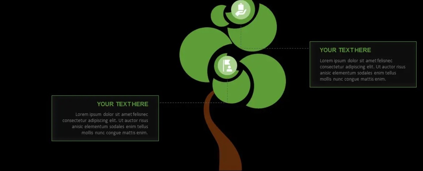
Are you looking for some impressive slides for your next presentation? Here we have a free PowerPoint tree diagram template, which you can download to create a killer presentation that will blow the minds of the audience.
Artistic and industrial design.
Civility is aggressively enforced: do not be rude, troll-y, flame-bait-y, etc. If someone else is, please report, block as necessary, and move on.
Comments that cannot reasonably lead to discussion or which have no analysis ("first!", "lol", [string of emojis]) will be deleted. Please do not post them.