You'll have to pry Comic Code from my cold dead hands!
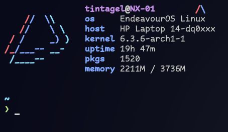
You'll have to pry Comic Code from my cold dead hands!
It looks alright. I might give it a try. I tested out a bunch of different mono fonts recently and landed on Fira Code. I'm still getting used to ligatures but so far I'm liking it more than I expected.
I like the curly braces (much easier to spot the difference from some other fonts that lack a well defined point).
But I'm still a fan of fira code for generally well done ligatures.
Edit: fira code, not sans.
I still find Fira Code and Meslo to be better. Nothing beats these 2 fonts.
I tried it at work for a few weeks but in the end I went back to Iosevka. Not sure if it’s something with the Intel font, being used to Iosevka, some combination of those, or something completely unrelated, but it’s the only font I can use comfortably on daily basis, after migrating from Operator
For my taste it looked a little too wide. Not as good as JetBrains Mono.
I personally like the Jetbrains Mono font
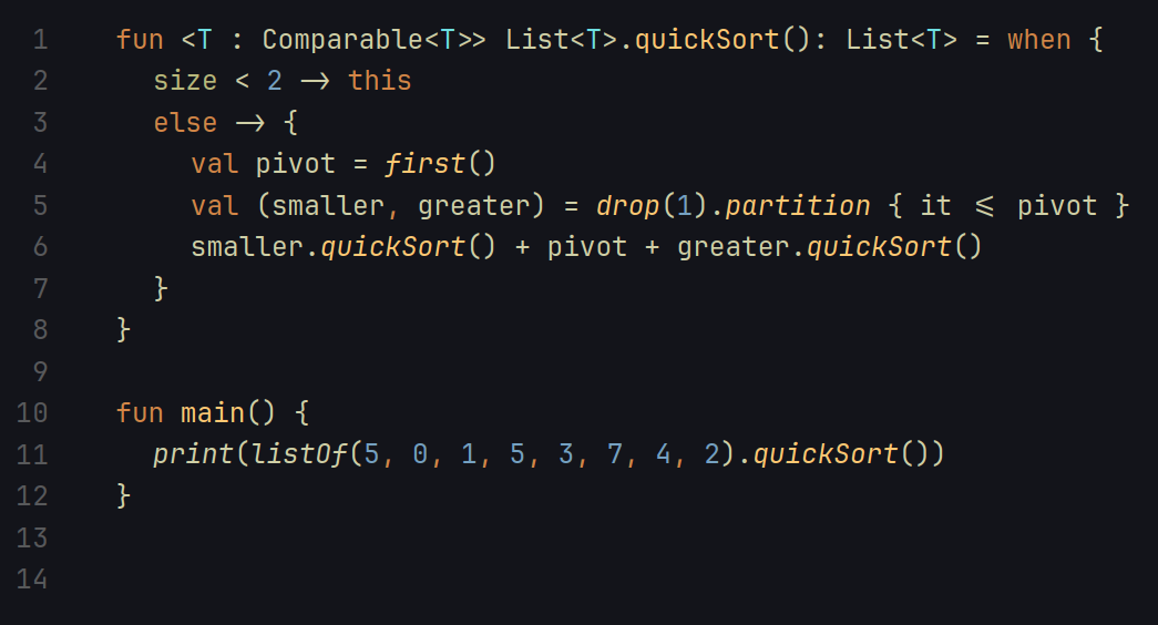
For me Dejavu sans mono is a really good mono font, and it's Foss 🙂
top 14 comments