177

Post got locked (sorry y'all, not sure what I did) but here's the updated original source for the chart data https://nsidc.org/snow-today/snow-viewer

Post got locked (sorry y'all, not sure what I did) but here's the updated original source for the chart data https://nsidc.org/snow-today/snow-viewer
Yeah, we broke the polar vortex, remember? Shit is different now, forever.
Spring is the new summer.
And summer will be Hell.
It sucks that the capital is on the East Coast, which saw slightly below average winter temperatures. Easy to pretend all is well when you can still throw a snowball, while the other half of the country is riding mountain bikes where they should be snowboarding.
Unfortunately the current government's axe man (Im not even saying that rat bastard's name) defunded and shut down every single weather and atmospheric observatory, so that none of the data from the sattelite observatories can be released, not to mention the last set of governments only giving lip service to 'meeting climate agreement goals'
At least they are not releasing fake data like they are doing on the economic front. Imagine sweltering in the March heat (???) and NOAA tell you it's barely 75 and the world is alright!
Much of the East Coast had an abnormally cold winter this year.

That's what made this winter special, the clear difference between the Rockies/West and the East was pretty stark.
The lowest so far! They are working hardly to break this record in der next years, as you can see by their efforts to contibute to the emission of greenhouse gases especially in the middel east /s
La AEMT falla cuando estima ergo el cambio climático es una patraña. Que me lo ha dicho mi cuñao de Vox
They're right, the only people that think it's a hoax aren't brave enough or smart enough to look at the data that the world is putting out and see the changes happening in front of our eyes.
(Sorry for not responding in Spanish, but I refuse to use a robot to butcher your language :D)
Ok, but overlay El Nino years to get a perspective because those are usually the dry, cold years.
https://ourworldindata.org/global-temperatures-el-nino-la-nina
Very true, there certainly is an oscillation.
this is january news. it's almost april
The top graph in the post shows March data, as does the link
Why did you link a blog post from January, with January data, and then add your own March charts to this post? You probably shouldn't have linked to the external post the first place.
that's 2023 in blue
Yes... Now look at the black line. The one that's labeled as 2026.
that's red. it says january right next to it. do you need an ishihara?

This one. The one in the post.
That's the wrong graph. Look for the one with all the pretty colours mate.
not clicking on a link if you can't figure out the right month dude.
I'm not the one who can't even read a graph.
But here, just in case you change your mind here's an interactive map with an extra graph that provided the original data for the graph
oh wow you get worked up over someone not caring about your post.
For someone that "doesn't care" you sure do comment a lot.

And just in case you're still scared of links. Heres the graph showing updated information, the line in BLUE is this year.
Discussion of climate, how it is changing, activism around that, the politics, and the energy systems change we need in order to stabilize things.
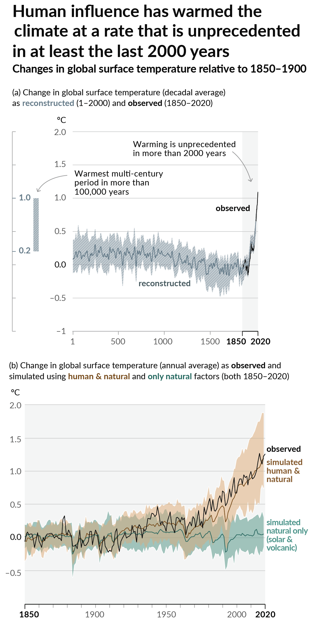
As a starting point, the burning of fossil fuels, and to a lesser extent deforestation and release of methane are responsible for the warming in recent decades:
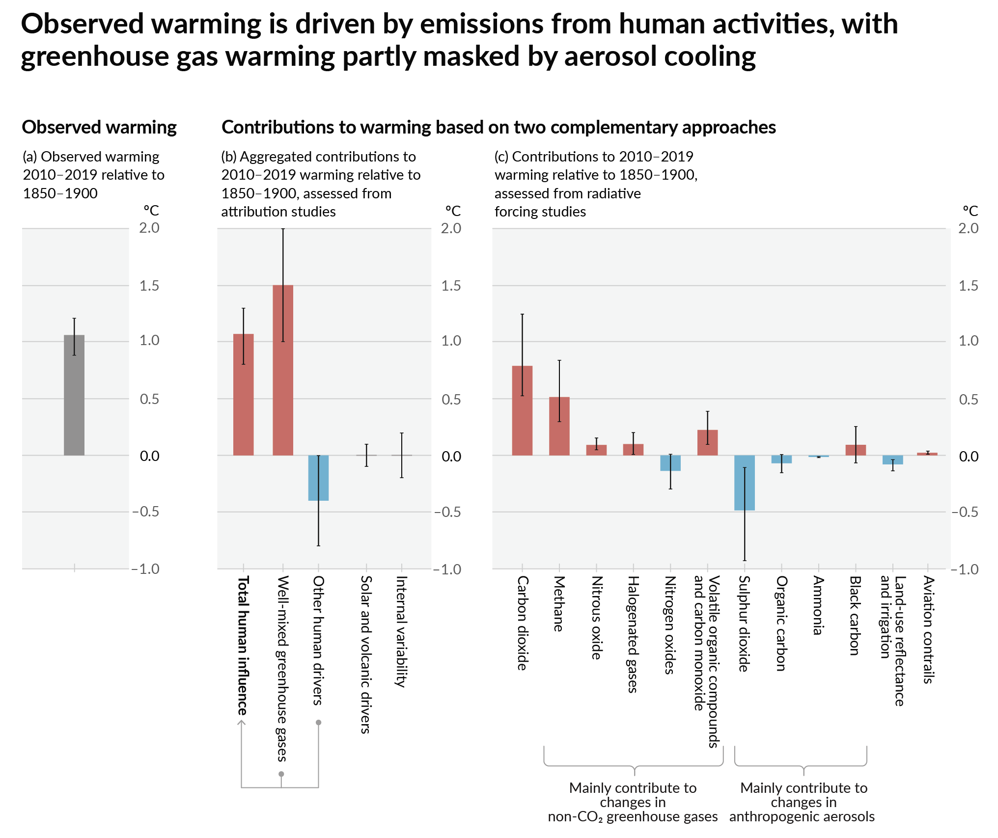
How much each change to the atmosphere has warmed the world:
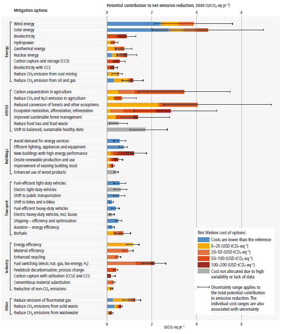
Recommended actions to cut greenhouse gas emissions in the near future:
Anti-science, inactivism, and unsupported conspiracy theories are not ok here.