post
“It’s [the Mercator projection] the world’s longest misinformation and disinformation campaign, and it just simply has to stop.”
No matter how we cut it though, all 2D projections will have some kind of distortion. They opted to preserve area, while the Mercator preserves angles. Arguably it is less important today to preserve angles, as we have automatic navigation systems. There are some alternatives that also preserve the area: https://upload.wikimedia.org/wikipedia/commons/7/76/The-Equal-Earth-compared-to-similar-equal-area-pseudocylindrical-projections.png
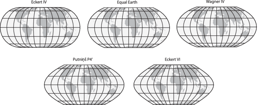
Right. What people need to understand that any globe put on a flat surface will be distorted. Their proposal is just as distorted as the Mercator, just in area vs angles as you stated.
It's not a damn campaign. Activists never seem to be good at nuance.
We should encourage the use of more globes to represent world maps.
Like, seriously. Almost all maps are viewed on a computer screen, all computers easily have the ability to display a sphere and rotate it
The simple fact is no map projection will be perfect or do anyone "justice".
You're flattening out a sphere to a flat rectangle. A lot of compromises have to be made. So go with the one that functions best for navigation.
Well a rectangle gives you easy direction, true north is always up. But you can map very accurate maps that are not rectangle. They just make navigation a bitch
Some projections are better than others. The Mercator projection at least has a use case that justifies its creation. This map has no purpose other than a political one.
Everyone with a cursory knowledge of maps knows there are inherent issues protecting a 3d object into a 2d surface. That's fine because some projections are useful
I'm going to be honest, this just looks utterly useless for any country that isn't south africa, and ESPECIALLY useless for any country in the northern hemisphere.
Like, yes, sure, you've made all the country's areas roughly equal, but also every single country that isn't south africa is a distorted, warped mess that looks nothing like its actual shape.
Look at parts of europe- every country is a COMPLETELY USELESS shape. Three quarters of them have been turned into diagonal lines. How the fuck is that useful? Europe is the worst area in that regard, but by no means the only one.
It makes it literally useless as a map.
Every country looks distorted and warped based on your lifetime of experience looking at mercator projection. Every country looks warped and distorted when compared to globes. We learn geography on a flat surface which is inherently distorted because we live on a round surface
Actually, fun fact, the entire point of the Mercator projection is that it DOES maintain shapes/angles, just not scale. It's a nautical map, it's for sailing. That's why when you look at a mercator map and a globe, the countries look about the same, just potentially different sizes- because that's literally the point of it.
Who actually uses it as a map though? It's usually only seen briefly in apps, or in various symbols, or on a classroom wall. As a symbol, having the rights sizes would be a significant improvement. In an app, people will zoom in anyway, so at least they'd passively see the correct proportions when zooming out, instead of getting a false impression. In a classroom, it would seem all that more importantly to not give false impressions to kids.
I really like the Dymaxion projection.
Like completely, or just as a default?
It's uniquely the best option if you like using compass bearings.
Or just want a map that you can cut a small piece (up to a square 10° of longitude) from and have it just work (no skewing or non-proportional scaling required) although non-interactive world maps should use Robinson, Winkel-Tripel or something.
Of course, "a square 10° of latitude", while the same size on the full map, will cover different areas. The side length is approximately:
- 1110 km near the equator (0°)
- 960 km in North/South Africa or Florida (30°)
- 790 km in NYC, Venice or south NZ (45°)
- 558 km in Oslo, Anchorage or northernmost Antarctic islands (60°)
- 289 km in central Greenland, northernmost peninsula of Russia or Canada or southernmost sea (75°)
- at higher latitudes, approx. 𝑥 km when 6𝑥 km from the pole
If you're at the Amundsen-Scott research station, a square 10° of latitude won't do, as it covers just about your bed.
I think equal area maps make a lot of sense, but the one I’ve seen promoted in the past as “fair” is the Peters Projection which is quite frankly trash.
It was designed to preserve angles at the equator, and as a consequence all the shapes at higher latitudes are badly squished in the vertical.
If there has to be distortion to preserve areas, it should squish in both dimensions and try to optimize shapes around the middle latitudes.
Ok come up with something that's better and just as practical.
They did. They are specifically advocating for the Equal Earth projection.
I mean everything is approximately to scale i guess, but the further east or west you get from Europe/Africa the more bent things get. Including the area that 75% of the worlds population live.
Well yeah, every map projection has to mis-represent something. In this case they're arguing that presenting area is more important than presenting angles. Outside of long-distance travel on ships and planes, which are not using general-purpose world maps, nobody is navigating with a world map, so I think that they're probably right here. It seems more important to me to understand the relative size of Africa to other landmasses than it is to know that the Korean peninsula is actually a few degrees off of being straight north of Borneo
Such a beautiful scene.
"But you can't do that!"
"Why not?"
"Because you're freaking me out!"
Beat me to it. Except it's more like 25 years. Now get off my lawn.
It was very much a real discussion back then as well. The writers didn’t invent this argument.
People have been complaining about maps in general since we first started making them. The Gall-Peters projection that they mentioned traces its origins back to 1855 when James Gall first introduced the concept.
In the 1970’s, Arno Peters made this projection well known. He specifically argued the point the show makes: other maps distort our perception of the world and it fosters problems with how we treat some countries.
https://en.m.wikipedia.org/wiki/Gall%E2%80%93Peters_projection
Looking at the correct map makes it clear that our Risk Continent Troop values need updated now.
Reminds me of the West Wing episode with the Petersen (?) projection map. Although I seem to remember that map format was under copyright and would have required a fee for every use. An intended consequence?

top 50 comments