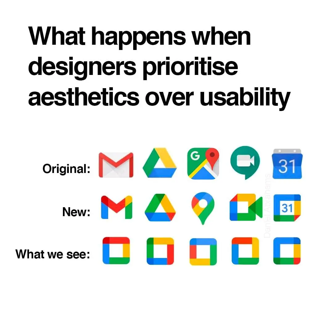
▲ 1534 ▼ I hate these icons (gregtech.eu) submitted 2 years ago by gregor@gregtech.eu to c/memes@lemmy.ml 149 comments fedilink hide all child comments
[–] Prunebutt@slrpnk.net 143 points 2 years ago* (11 children) It's not even more aestetic. Just more unified in branding. permalink fedilink source hideshow 11 child comments replies: [–] pewpew@feddit.it 54 points 2 years ago (1 child) And the interface of their apps are still incoherent af. I don't know how, but they manage to make things worse every time permalink fedilink source parent hideshow 1 child comment replies: [–] AnUnusualRelic@lemmy.world 27 points 2 years ago It's ok, they'll just retire the service eventually. permalink fedilink source parent [–] magic_lobster_party@fedia.io 26 points 2 years ago (3 children) Yeah, the old logos were all over the place. At first glance it’s not obvious they’re all Google apps. permalink fedilink source parent hideshow 3 child comments replies: [–] jmcs@discuss.tchncs.de 33 points 2 years ago (1 child) And? All of those being part of the same walled garden is a bug in the legal system not a feature. permalink fedilink source parent hideshow 1 child comment replies: [–] magic_lobster_party@fedia.io 16 points 2 years ago Better be explicit about the walled garden rather than being diffuse about it permalink fedilink source parent [–] Prunebutt@slrpnk.net 13 points 2 years ago To me, that's just the case for camera and calendar. Maps is IMHO perfect (except the unnecessary G) and the red-and-white envelope is quite well-known. permalink fedilink source parent [–] Ephera@lemmy.ml 8 points 2 years ago I think what really bothers me about the aesthetics is that the shapes are broken up by the coloration. For example, the pin icon for Google Maps looks almost like a hook, because the yellow has little contrast on this white background. permalink fedilink source parent [–] SuperSaiyanSwag@lemmy.zip 3 points 2 years ago And that’s why I don’t really hate it. I hate Google, but I think it’s a neat design choice. I still hate Microsoft’s icon design a lot though, they can’t seem to stick with one thing. permalink fedilink source parent [–] victorz@lemmy.world 2 points 2 years ago (1 child) Whatever. It sucks ass is the point. permalink fedilink source parent hideshow 1 child comment replies: [–] Prunebutt@slrpnk.net 8 points 2 years ago My point is that it's also ugly. permalink fedilink source parent [–] where_am_i@sh.itjust.works 2 points 2 years ago I definitely find it more aesthetically pleasing. Just like the icon packs. permalink fedilink source parent
[–] pewpew@feddit.it 54 points 2 years ago (1 child) And the interface of their apps are still incoherent af. I don't know how, but they manage to make things worse every time permalink fedilink source parent hideshow 1 child comment replies: [–] AnUnusualRelic@lemmy.world 27 points 2 years ago It's ok, they'll just retire the service eventually. permalink fedilink source parent
[–] AnUnusualRelic@lemmy.world 27 points 2 years ago It's ok, they'll just retire the service eventually. permalink fedilink source parent
[–] magic_lobster_party@fedia.io 26 points 2 years ago (3 children) Yeah, the old logos were all over the place. At first glance it’s not obvious they’re all Google apps. permalink fedilink source parent hideshow 3 child comments replies: [–] jmcs@discuss.tchncs.de 33 points 2 years ago (1 child) And? All of those being part of the same walled garden is a bug in the legal system not a feature. permalink fedilink source parent hideshow 1 child comment replies: [–] magic_lobster_party@fedia.io 16 points 2 years ago Better be explicit about the walled garden rather than being diffuse about it permalink fedilink source parent [–] Prunebutt@slrpnk.net 13 points 2 years ago To me, that's just the case for camera and calendar. Maps is IMHO perfect (except the unnecessary G) and the red-and-white envelope is quite well-known. permalink fedilink source parent
[–] jmcs@discuss.tchncs.de 33 points 2 years ago (1 child) And? All of those being part of the same walled garden is a bug in the legal system not a feature. permalink fedilink source parent hideshow 1 child comment replies: [–] magic_lobster_party@fedia.io 16 points 2 years ago Better be explicit about the walled garden rather than being diffuse about it permalink fedilink source parent
[–] magic_lobster_party@fedia.io 16 points 2 years ago Better be explicit about the walled garden rather than being diffuse about it permalink fedilink source parent
[–] Prunebutt@slrpnk.net 13 points 2 years ago To me, that's just the case for camera and calendar. Maps is IMHO perfect (except the unnecessary G) and the red-and-white envelope is quite well-known. permalink fedilink source parent
[–] Ephera@lemmy.ml 8 points 2 years ago I think what really bothers me about the aesthetics is that the shapes are broken up by the coloration. For example, the pin icon for Google Maps looks almost like a hook, because the yellow has little contrast on this white background. permalink fedilink source parent
[–] SuperSaiyanSwag@lemmy.zip 3 points 2 years ago And that’s why I don’t really hate it. I hate Google, but I think it’s a neat design choice. I still hate Microsoft’s icon design a lot though, they can’t seem to stick with one thing. permalink fedilink source parent
[–] victorz@lemmy.world 2 points 2 years ago (1 child) Whatever. It sucks ass is the point. permalink fedilink source parent hideshow 1 child comment replies: [–] Prunebutt@slrpnk.net 8 points 2 years ago My point is that it's also ugly. permalink fedilink source parent
[–] Prunebutt@slrpnk.net 8 points 2 years ago My point is that it's also ugly. permalink fedilink source parent
[–] where_am_i@sh.itjust.works 2 points 2 years ago I definitely find it more aesthetically pleasing. Just like the icon packs. permalink fedilink source parent