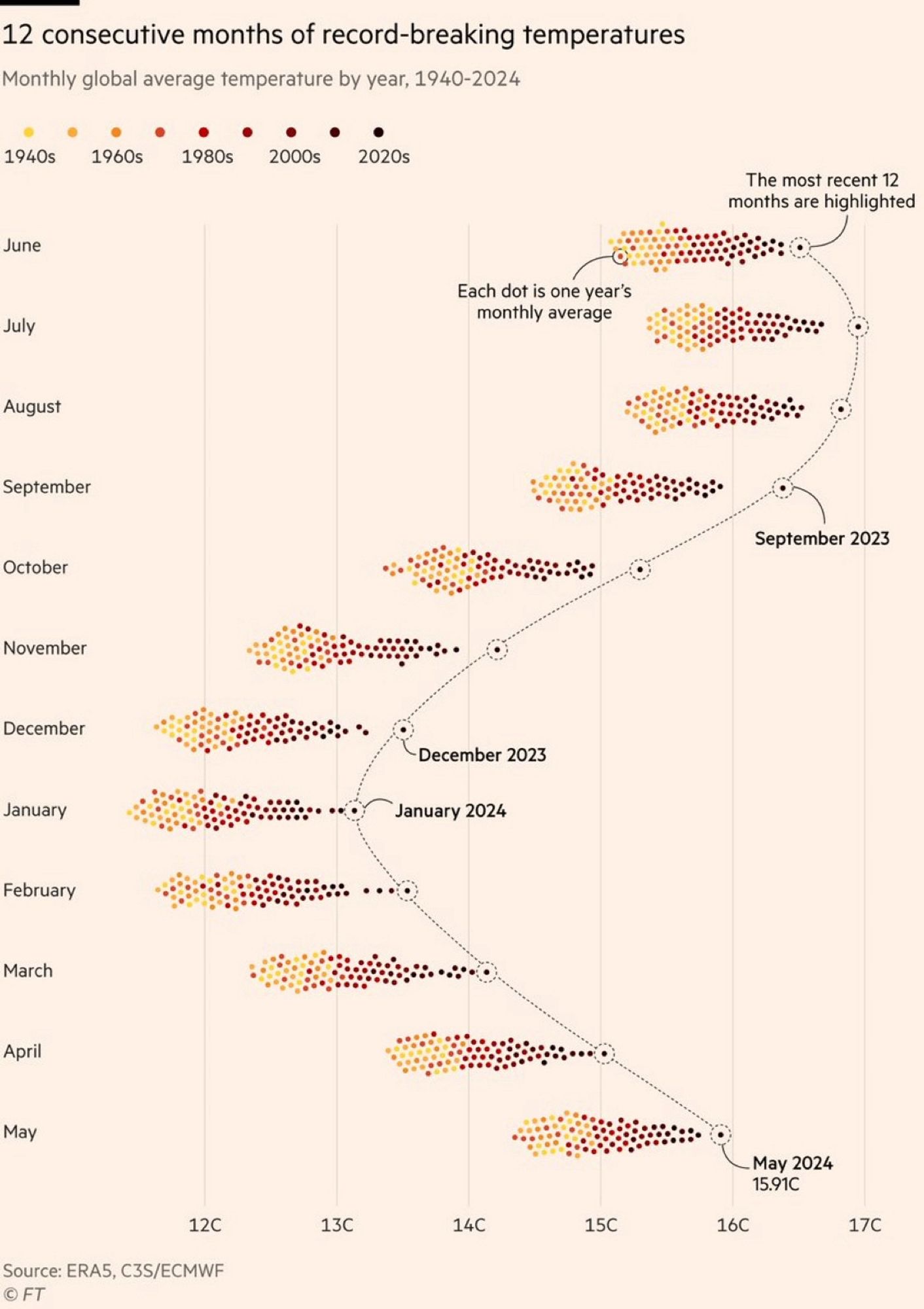
The color grading of the years is really bad. The last 20/30 years are all very low in contrast compared to each other, while 1940s and 60s are easy to tell apart, where it is least important. There are so many more colors than yellow/orange/brown, we can use them to get more information density.