▲ 651 ▼ Climate records tumble, leaving Earth in uncharted territory - scientists (www.bbc.com) submitted 3 years ago by redhydride@lemmy.ml to c/worldnews@lemmy.ml 122 comments fedilink hide all child comments
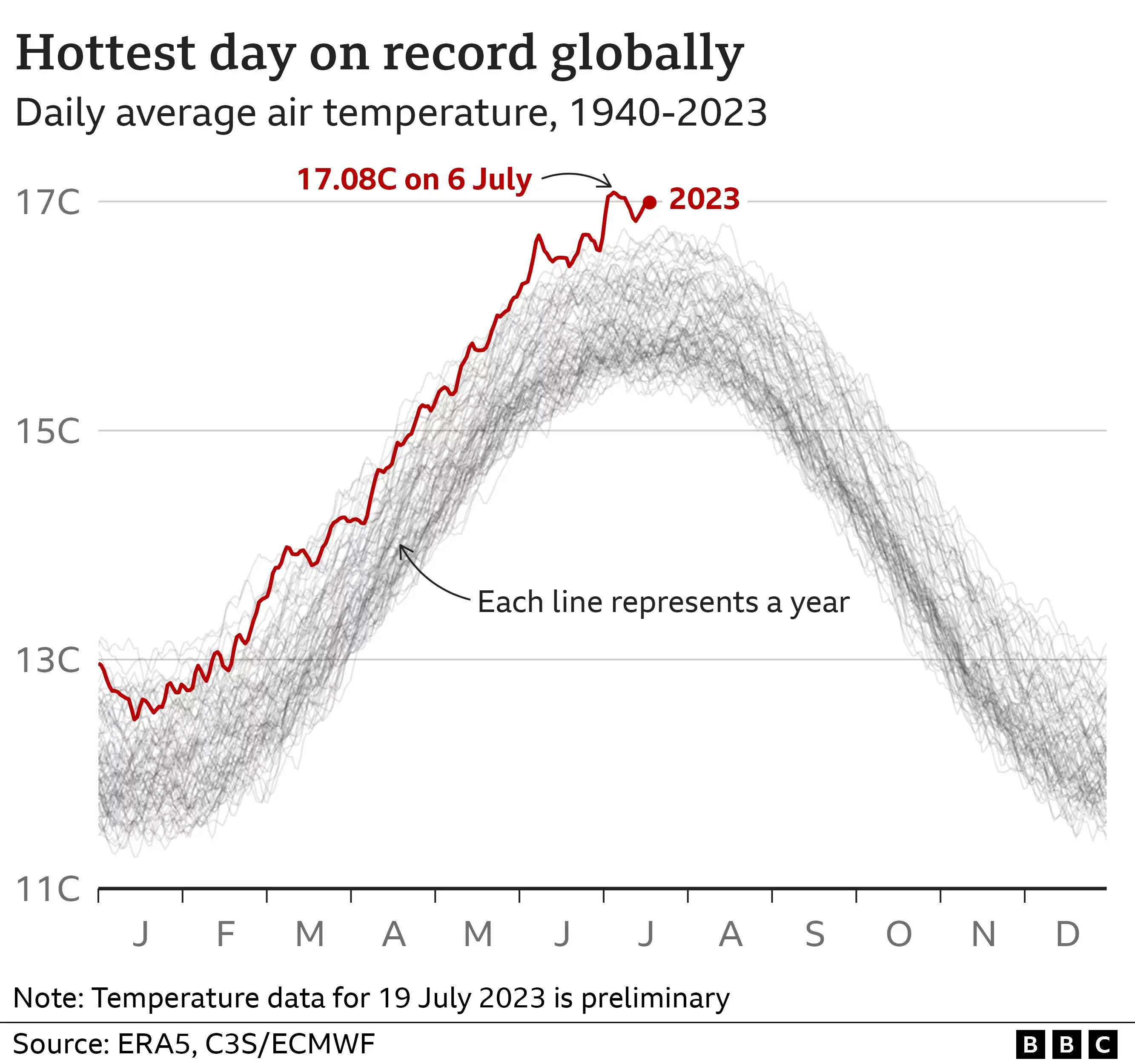
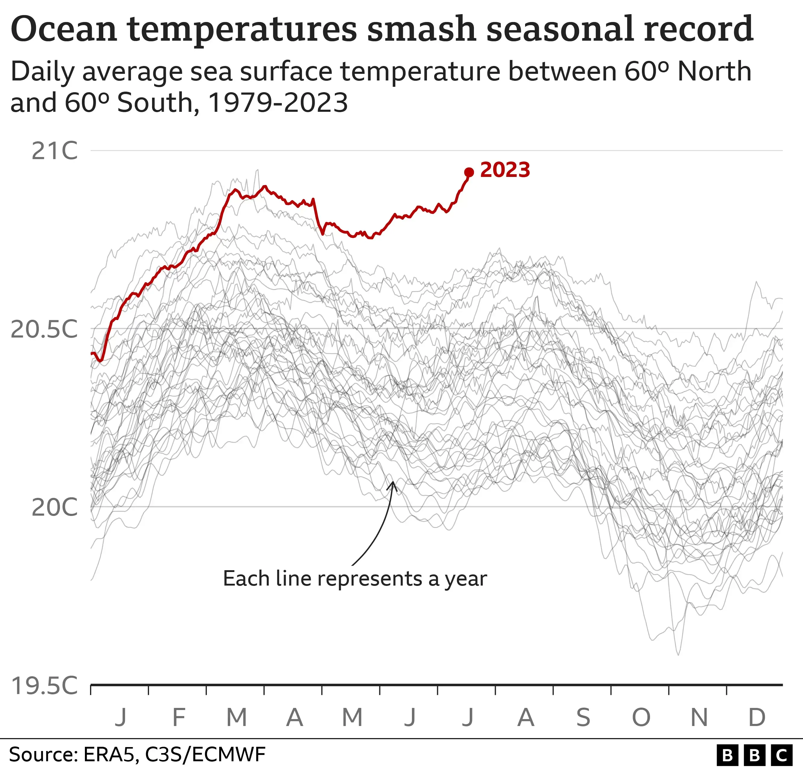
[–] fearout@kbin.social 15 points 3 years ago (1 child) Remember that since this is a planet-wide average, it includes places like the North Pole and Antarctica. Or just look at the graphs — it’s a pretty visual demonstration of how extremely abnormal recent temperature changes are. permalink fedilink source parent hideshow 2 child comments replies: [+] tallwookie@lemmy.world -28 points 3 years ago (1 child) yes the graphics are very shocking, to be sure - why is it only limited to 44 years though? do records not extend back further than that? I seem to remember reading somewhere that there's climate records from as early as the 1880s but maybe that was in England only. though, even 44 years, while easily half of a human's lifetime, it's just a tiny blip on a geologic time scale. permalink fedilink source parent hideshow 2 child comments replies: [–] fearout@kbin.social 18 points 3 years ago (1 child) Air temperature graph starts from 1940, that’s 83 years. Enough to gauge trends, since industrialization and copious CO2 emissions in particular are a pretty new thing. But here’s some data starting from the year 0, in case you’re interested. permalink fedilink source parent hideshow 2 child comments replies: [+] tallwookie@lemmy.world -23 points 3 years ago* (2 children) ah, some actual data, thanks! still, it looks like an average variance of 1 degree celsius over 2000+ years. let's be honest though - nothing is going to change in the next ~50 years or so, not enough to stop the slight raise in temperature. no one is willing to go back to living like medieval peasants prior to the industrial revolution. no one politician is going to enact any laws that will return society to that state. no coalition or governmental body is going to do it either. not in America, not in China, not in India, not in Europe. we would need most of northern africa and all of central australia covered by solar panels, wind turbines everywhere, and probably actual fusion reactors generating power in order to markably decrease global temperatures. permalink fedilink source parent hideshow 4 child comments replies: [–] fearout@kbin.social 22 points 3 years ago* (last edited 3 years ago) (1 child) Let me put it this way. The difference in average global temperature between the last ice age 100,000 years ago and pre-industrial earth around 100 years ago is just ~3.5C. The expected temperature rise due to recent climate change is about +3C. A lot is going to happen, and much sooner than in 50 years. With current trends, it looks like we’re heading towards severe climate destabilization, much more common extreme weather events, some parts of the world becoming uninhabitable for humans, lots of mass extinction events for many species, including those that humanity currently relies upon, and probable global famine. The fact that it’s not a complete extinction doesn’t make it fine. Sure, Earth as a planet will be fine. But the civilisation has some really hard challenges coming up, and it’s currently not prepared for them. permalink fedilink source parent hideshow 2 child comments replies: [+] tallwookie@lemmy.world -15 points 3 years ago (1 child) it's true that some changes are coming down the pipeline, I just dont see those changes having any noticeable effect in the next ~50 years. if it took 250 years for the climate to warm up (since the dawn of the industrial revolution), then it's going to take just as long to cool down - and that's presuming that we have the ability to make changes in our power generation methods to eliminate our dependence on coal/oil. a bit over 60% of all electricity generation, globally, comes from Coal, Gas, and Oil (in that order). we really just need reliable fusion & enough fuel for a few decades - by then the technology will have matured enough where we can get H3 from space. tangential to that would be to base solar power generation in a L4 or L5 orbit, then beam the power back to the surface. in regards to extinction/famine - the absolute maximum carrying capacity of Earth, in regards to our species, is somewhere between 9 and 10 billion. that's a hard limit, unless we're willing to live hand to mouth like some people do in the 3rd world (very few folks are going to sign up for that). we're at 8 billion or so now. people arent going to stop having kids unless they're forced to, or there's not enough food to feed them (though as recent decades in Africa have shown, usually not even then). at some point, famine on a massive scale is a nigh certain thing. perhaps we need to depopulate by 30% or so? I'm not a policy maker and neither is anyone on Lemmy, so it probably doesnt matter that much what we think. permalink fedilink source parent hideshow 2 child comments replies: [–] fearout@kbin.social 11 points 3 years ago (1 child) It didn’t really take 250 years though, early emissions were almost negligible. Most of it started like 60 years ago. You’re right that we’re not stopping it anytime soon, but the effective timelines are shorter than centuries. Also, what’s your reasoning/source on a 10 bn “absolute” cap? It might be a cap while using modern farming, technologies and logistics, but it’s not absolute by any means. You mention beaming energy from space, then why not mention Eucomenopolis concepts that allow for trillions of people to inhabit Earth? :) Or simply once you have fusion, you can have vertical farms and Arcologies that can sustain a much larger population. The issue isn’t that it’s impossible, rather that we’re not gonna develop any of this tech before humanity faces existential problems in many parts of the world. Also, it’s weird that you got from “this temperature variance is minimal” and “this average is on the low side of comfortable” to “let’s get rid of 30% of population then”. o_O permalink fedilink source parent hideshow 2 child comments replies: [+] tallwookie@lemmy.world -6 points 3 years ago (1 child) oh there are many different solutions, i just mentioned a few of the more realistic ones. materials science will need to improve by several magnitudes before true arcologies are possible. but yes, it's unlikely that we'll develop the tech we need in the timeframe. carrying capacity? i looked into it several years ago after reading about it somewhere. probably sci-fi, I do enjoy those. on the low end, it's around 2 billion. an 80% population drop may be required. there will be resource wars before that happens though & quite likely a few exchanges of strategic nuclear weapons. presumably the famines would drastically increase after that? I supose we'll see. permalink fedilink source parent hideshow 2 child comments replies: [–] rackmountrambo@kbin.social 3 points 3 years ago (1 child) In closing, I got mine. permalink fedilink source parent hideshow 2 child comments replies: [–] tallwookie@lemmy.world -3 points 3 years ago congratulations! permalink fedilink source parent [–] DogMuffins@discuss.tchncs.de 10 points 3 years ago (2 children) Let's be honest though, actually solving this problem is pretty much unachievable given the lack of motivation and interest on the part of the populace, so why bother taking any action to mitigate the problem at all? I'm really only interested in punchy 3 word concepts like "stop abortion now" or "fix gay people". The whole idea of investing some effort now so that the world is better off to some unknown extent later is pretty much Socialism. We won the cold war. permalink fedilink source parent hideshow 4 child comments replies: [–] rackmountrambo@kbin.social 2 points 3 years ago (1 child) The populace isn't who creates most of the greenhouse gasses. Try again. permalink fedilink source parent hideshow 2 child comments replies: [–] DogMuffins@discuss.tchncs.de -1 points 3 years ago (1 child) Of course it is. The populace owns shares in, and buys products from, companies which are producing greenhouse gasses. The populace elects representatives to regulate those companies. permalink fedilink source parent hideshow 2 child comments replies: [–] ltxrtquq@lemmy.ml 2 points 3 years ago (1 child) The wealthiest 10% owns 90% of all stocks. And realistically, how many people can actually track the supply chain of every product they buy to try to only buy from ethical companies? How many truly plastic free options even are there for basic things like bread, toothbrushes/toothpaste, or soap? permalink fedilink source parent hideshow 2 child comments replies: [–] DogMuffins@discuss.tchncs.de 0 points 3 years ago (1 child) You don't need to track the entire supply chain of every product. permalink fedilink source parent hideshow 2 child comments replies: [–] ltxrtquq@lemmy.ml 2 points 3 years ago Then how are you supposed to know which companies produce how much greenhouse gasses? permalink fedilink source parent [+] tallwookie@lemmy.world -7 points 3 years ago true enough - soundbites have always been a problem in journalism, and social media has hopped onto that bandwagon recently as well. the short attention span of any average person is at fault as well. overall, I'd say there's a fair amount of interest in "solving global warming" or whatever short descriptor you want to use, but I agree that there's very little motivation. actual movement towards a solution would require generations of political capital, quite a bit of social capital, actual money - probably trillions of $$$ each year - and the realization that there is no way to "cheat" your way to cleaning up the mess. by that, I mean we will need to keep using our coal/gas power plants for some decades yet, and we'll also need to ramp up the pollution at least one whole order of magnitude in order to create enough energy storage to make it through the night or when the wind isnt blowing or the sun isnt shining (or during the winter, when solar is effectively useless in the northern equator, where most people live). even with all of that in mind, you'd still have to force people to use less, drive less, eat less, have fewer children; basically eliminate international shipping & bring manufacturing back home (really unlikely), eliminate air travel, and basically eliminate domestic shipping (unless we have reliable, cheap electricity). a return to life prior to WW2. possible? yes. achievable in any reasonable timeframe? no. I also agree that the truth would need to be massaged in order for the masses to accept it - some parts of the world are rabidly anti-socialist, whereas other parts are happy to be obedient little robots for the good of the State. problem is, those socialist-leaning countries are the ones who have the most to lose when international trade is eliminated. permalink fedilink source parent
[+] tallwookie@lemmy.world -28 points 3 years ago (1 child) yes the graphics are very shocking, to be sure - why is it only limited to 44 years though? do records not extend back further than that? I seem to remember reading somewhere that there's climate records from as early as the 1880s but maybe that was in England only. though, even 44 years, while easily half of a human's lifetime, it's just a tiny blip on a geologic time scale. permalink fedilink source parent hideshow 2 child comments replies: [–] fearout@kbin.social 18 points 3 years ago (1 child) Air temperature graph starts from 1940, that’s 83 years. Enough to gauge trends, since industrialization and copious CO2 emissions in particular are a pretty new thing. But here’s some data starting from the year 0, in case you’re interested. permalink fedilink source parent hideshow 2 child comments replies: [+] tallwookie@lemmy.world -23 points 3 years ago* (2 children) ah, some actual data, thanks! still, it looks like an average variance of 1 degree celsius over 2000+ years. let's be honest though - nothing is going to change in the next ~50 years or so, not enough to stop the slight raise in temperature. no one is willing to go back to living like medieval peasants prior to the industrial revolution. no one politician is going to enact any laws that will return society to that state. no coalition or governmental body is going to do it either. not in America, not in China, not in India, not in Europe. we would need most of northern africa and all of central australia covered by solar panels, wind turbines everywhere, and probably actual fusion reactors generating power in order to markably decrease global temperatures. permalink fedilink source parent hideshow 4 child comments replies: [–] fearout@kbin.social 22 points 3 years ago* (last edited 3 years ago) (1 child) Let me put it this way. The difference in average global temperature between the last ice age 100,000 years ago and pre-industrial earth around 100 years ago is just ~3.5C. The expected temperature rise due to recent climate change is about +3C. A lot is going to happen, and much sooner than in 50 years. With current trends, it looks like we’re heading towards severe climate destabilization, much more common extreme weather events, some parts of the world becoming uninhabitable for humans, lots of mass extinction events for many species, including those that humanity currently relies upon, and probable global famine. The fact that it’s not a complete extinction doesn’t make it fine. Sure, Earth as a planet will be fine. But the civilisation has some really hard challenges coming up, and it’s currently not prepared for them. permalink fedilink source parent hideshow 2 child comments replies: [+] tallwookie@lemmy.world -15 points 3 years ago (1 child) it's true that some changes are coming down the pipeline, I just dont see those changes having any noticeable effect in the next ~50 years. if it took 250 years for the climate to warm up (since the dawn of the industrial revolution), then it's going to take just as long to cool down - and that's presuming that we have the ability to make changes in our power generation methods to eliminate our dependence on coal/oil. a bit over 60% of all electricity generation, globally, comes from Coal, Gas, and Oil (in that order). we really just need reliable fusion & enough fuel for a few decades - by then the technology will have matured enough where we can get H3 from space. tangential to that would be to base solar power generation in a L4 or L5 orbit, then beam the power back to the surface. in regards to extinction/famine - the absolute maximum carrying capacity of Earth, in regards to our species, is somewhere between 9 and 10 billion. that's a hard limit, unless we're willing to live hand to mouth like some people do in the 3rd world (very few folks are going to sign up for that). we're at 8 billion or so now. people arent going to stop having kids unless they're forced to, or there's not enough food to feed them (though as recent decades in Africa have shown, usually not even then). at some point, famine on a massive scale is a nigh certain thing. perhaps we need to depopulate by 30% or so? I'm not a policy maker and neither is anyone on Lemmy, so it probably doesnt matter that much what we think. permalink fedilink source parent hideshow 2 child comments replies: [–] fearout@kbin.social 11 points 3 years ago (1 child) It didn’t really take 250 years though, early emissions were almost negligible. Most of it started like 60 years ago. You’re right that we’re not stopping it anytime soon, but the effective timelines are shorter than centuries. Also, what’s your reasoning/source on a 10 bn “absolute” cap? It might be a cap while using modern farming, technologies and logistics, but it’s not absolute by any means. You mention beaming energy from space, then why not mention Eucomenopolis concepts that allow for trillions of people to inhabit Earth? :) Or simply once you have fusion, you can have vertical farms and Arcologies that can sustain a much larger population. The issue isn’t that it’s impossible, rather that we’re not gonna develop any of this tech before humanity faces existential problems in many parts of the world. Also, it’s weird that you got from “this temperature variance is minimal” and “this average is on the low side of comfortable” to “let’s get rid of 30% of population then”. o_O permalink fedilink source parent hideshow 2 child comments replies: [+] tallwookie@lemmy.world -6 points 3 years ago (1 child) oh there are many different solutions, i just mentioned a few of the more realistic ones. materials science will need to improve by several magnitudes before true arcologies are possible. but yes, it's unlikely that we'll develop the tech we need in the timeframe. carrying capacity? i looked into it several years ago after reading about it somewhere. probably sci-fi, I do enjoy those. on the low end, it's around 2 billion. an 80% population drop may be required. there will be resource wars before that happens though & quite likely a few exchanges of strategic nuclear weapons. presumably the famines would drastically increase after that? I supose we'll see. permalink fedilink source parent hideshow 2 child comments replies: [–] rackmountrambo@kbin.social 3 points 3 years ago (1 child) In closing, I got mine. permalink fedilink source parent hideshow 2 child comments replies: [–] tallwookie@lemmy.world -3 points 3 years ago congratulations! permalink fedilink source parent [–] DogMuffins@discuss.tchncs.de 10 points 3 years ago (2 children) Let's be honest though, actually solving this problem is pretty much unachievable given the lack of motivation and interest on the part of the populace, so why bother taking any action to mitigate the problem at all? I'm really only interested in punchy 3 word concepts like "stop abortion now" or "fix gay people". The whole idea of investing some effort now so that the world is better off to some unknown extent later is pretty much Socialism. We won the cold war. permalink fedilink source parent hideshow 4 child comments replies: [–] rackmountrambo@kbin.social 2 points 3 years ago (1 child) The populace isn't who creates most of the greenhouse gasses. Try again. permalink fedilink source parent hideshow 2 child comments replies: [–] DogMuffins@discuss.tchncs.de -1 points 3 years ago (1 child) Of course it is. The populace owns shares in, and buys products from, companies which are producing greenhouse gasses. The populace elects representatives to regulate those companies. permalink fedilink source parent hideshow 2 child comments replies: [–] ltxrtquq@lemmy.ml 2 points 3 years ago (1 child) The wealthiest 10% owns 90% of all stocks. And realistically, how many people can actually track the supply chain of every product they buy to try to only buy from ethical companies? How many truly plastic free options even are there for basic things like bread, toothbrushes/toothpaste, or soap? permalink fedilink source parent hideshow 2 child comments replies: [–] DogMuffins@discuss.tchncs.de 0 points 3 years ago (1 child) You don't need to track the entire supply chain of every product. permalink fedilink source parent hideshow 2 child comments replies: [–] ltxrtquq@lemmy.ml 2 points 3 years ago Then how are you supposed to know which companies produce how much greenhouse gasses? permalink fedilink source parent [+] tallwookie@lemmy.world -7 points 3 years ago true enough - soundbites have always been a problem in journalism, and social media has hopped onto that bandwagon recently as well. the short attention span of any average person is at fault as well. overall, I'd say there's a fair amount of interest in "solving global warming" or whatever short descriptor you want to use, but I agree that there's very little motivation. actual movement towards a solution would require generations of political capital, quite a bit of social capital, actual money - probably trillions of $$$ each year - and the realization that there is no way to "cheat" your way to cleaning up the mess. by that, I mean we will need to keep using our coal/gas power plants for some decades yet, and we'll also need to ramp up the pollution at least one whole order of magnitude in order to create enough energy storage to make it through the night or when the wind isnt blowing or the sun isnt shining (or during the winter, when solar is effectively useless in the northern equator, where most people live). even with all of that in mind, you'd still have to force people to use less, drive less, eat less, have fewer children; basically eliminate international shipping & bring manufacturing back home (really unlikely), eliminate air travel, and basically eliminate domestic shipping (unless we have reliable, cheap electricity). a return to life prior to WW2. possible? yes. achievable in any reasonable timeframe? no. I also agree that the truth would need to be massaged in order for the masses to accept it - some parts of the world are rabidly anti-socialist, whereas other parts are happy to be obedient little robots for the good of the State. problem is, those socialist-leaning countries are the ones who have the most to lose when international trade is eliminated. permalink fedilink source parent
[–] fearout@kbin.social 18 points 3 years ago (1 child) Air temperature graph starts from 1940, that’s 83 years. Enough to gauge trends, since industrialization and copious CO2 emissions in particular are a pretty new thing. But here’s some data starting from the year 0, in case you’re interested. permalink fedilink source parent hideshow 2 child comments replies: [+] tallwookie@lemmy.world -23 points 3 years ago* (2 children) ah, some actual data, thanks! still, it looks like an average variance of 1 degree celsius over 2000+ years. let's be honest though - nothing is going to change in the next ~50 years or so, not enough to stop the slight raise in temperature. no one is willing to go back to living like medieval peasants prior to the industrial revolution. no one politician is going to enact any laws that will return society to that state. no coalition or governmental body is going to do it either. not in America, not in China, not in India, not in Europe. we would need most of northern africa and all of central australia covered by solar panels, wind turbines everywhere, and probably actual fusion reactors generating power in order to markably decrease global temperatures. permalink fedilink source parent hideshow 4 child comments replies: [–] fearout@kbin.social 22 points 3 years ago* (last edited 3 years ago) (1 child) Let me put it this way. The difference in average global temperature between the last ice age 100,000 years ago and pre-industrial earth around 100 years ago is just ~3.5C. The expected temperature rise due to recent climate change is about +3C. A lot is going to happen, and much sooner than in 50 years. With current trends, it looks like we’re heading towards severe climate destabilization, much more common extreme weather events, some parts of the world becoming uninhabitable for humans, lots of mass extinction events for many species, including those that humanity currently relies upon, and probable global famine. The fact that it’s not a complete extinction doesn’t make it fine. Sure, Earth as a planet will be fine. But the civilisation has some really hard challenges coming up, and it’s currently not prepared for them. permalink fedilink source parent hideshow 2 child comments replies: [+] tallwookie@lemmy.world -15 points 3 years ago (1 child) it's true that some changes are coming down the pipeline, I just dont see those changes having any noticeable effect in the next ~50 years. if it took 250 years for the climate to warm up (since the dawn of the industrial revolution), then it's going to take just as long to cool down - and that's presuming that we have the ability to make changes in our power generation methods to eliminate our dependence on coal/oil. a bit over 60% of all electricity generation, globally, comes from Coal, Gas, and Oil (in that order). we really just need reliable fusion & enough fuel for a few decades - by then the technology will have matured enough where we can get H3 from space. tangential to that would be to base solar power generation in a L4 or L5 orbit, then beam the power back to the surface. in regards to extinction/famine - the absolute maximum carrying capacity of Earth, in regards to our species, is somewhere between 9 and 10 billion. that's a hard limit, unless we're willing to live hand to mouth like some people do in the 3rd world (very few folks are going to sign up for that). we're at 8 billion or so now. people arent going to stop having kids unless they're forced to, or there's not enough food to feed them (though as recent decades in Africa have shown, usually not even then). at some point, famine on a massive scale is a nigh certain thing. perhaps we need to depopulate by 30% or so? I'm not a policy maker and neither is anyone on Lemmy, so it probably doesnt matter that much what we think. permalink fedilink source parent hideshow 2 child comments replies: [–] fearout@kbin.social 11 points 3 years ago (1 child) It didn’t really take 250 years though, early emissions were almost negligible. Most of it started like 60 years ago. You’re right that we’re not stopping it anytime soon, but the effective timelines are shorter than centuries. Also, what’s your reasoning/source on a 10 bn “absolute” cap? It might be a cap while using modern farming, technologies and logistics, but it’s not absolute by any means. You mention beaming energy from space, then why not mention Eucomenopolis concepts that allow for trillions of people to inhabit Earth? :) Or simply once you have fusion, you can have vertical farms and Arcologies that can sustain a much larger population. The issue isn’t that it’s impossible, rather that we’re not gonna develop any of this tech before humanity faces existential problems in many parts of the world. Also, it’s weird that you got from “this temperature variance is minimal” and “this average is on the low side of comfortable” to “let’s get rid of 30% of population then”. o_O permalink fedilink source parent hideshow 2 child comments replies: [+] tallwookie@lemmy.world -6 points 3 years ago (1 child) oh there are many different solutions, i just mentioned a few of the more realistic ones. materials science will need to improve by several magnitudes before true arcologies are possible. but yes, it's unlikely that we'll develop the tech we need in the timeframe. carrying capacity? i looked into it several years ago after reading about it somewhere. probably sci-fi, I do enjoy those. on the low end, it's around 2 billion. an 80% population drop may be required. there will be resource wars before that happens though & quite likely a few exchanges of strategic nuclear weapons. presumably the famines would drastically increase after that? I supose we'll see. permalink fedilink source parent hideshow 2 child comments replies: [–] rackmountrambo@kbin.social 3 points 3 years ago (1 child) In closing, I got mine. permalink fedilink source parent hideshow 2 child comments replies: [–] tallwookie@lemmy.world -3 points 3 years ago congratulations! permalink fedilink source parent [–] DogMuffins@discuss.tchncs.de 10 points 3 years ago (2 children) Let's be honest though, actually solving this problem is pretty much unachievable given the lack of motivation and interest on the part of the populace, so why bother taking any action to mitigate the problem at all? I'm really only interested in punchy 3 word concepts like "stop abortion now" or "fix gay people". The whole idea of investing some effort now so that the world is better off to some unknown extent later is pretty much Socialism. We won the cold war. permalink fedilink source parent hideshow 4 child comments replies: [–] rackmountrambo@kbin.social 2 points 3 years ago (1 child) The populace isn't who creates most of the greenhouse gasses. Try again. permalink fedilink source parent hideshow 2 child comments replies: [–] DogMuffins@discuss.tchncs.de -1 points 3 years ago (1 child) Of course it is. The populace owns shares in, and buys products from, companies which are producing greenhouse gasses. The populace elects representatives to regulate those companies. permalink fedilink source parent hideshow 2 child comments replies: [–] ltxrtquq@lemmy.ml 2 points 3 years ago (1 child) The wealthiest 10% owns 90% of all stocks. And realistically, how many people can actually track the supply chain of every product they buy to try to only buy from ethical companies? How many truly plastic free options even are there for basic things like bread, toothbrushes/toothpaste, or soap? permalink fedilink source parent hideshow 2 child comments replies: [–] DogMuffins@discuss.tchncs.de 0 points 3 years ago (1 child) You don't need to track the entire supply chain of every product. permalink fedilink source parent hideshow 2 child comments replies: [–] ltxrtquq@lemmy.ml 2 points 3 years ago Then how are you supposed to know which companies produce how much greenhouse gasses? permalink fedilink source parent [+] tallwookie@lemmy.world -7 points 3 years ago true enough - soundbites have always been a problem in journalism, and social media has hopped onto that bandwagon recently as well. the short attention span of any average person is at fault as well. overall, I'd say there's a fair amount of interest in "solving global warming" or whatever short descriptor you want to use, but I agree that there's very little motivation. actual movement towards a solution would require generations of political capital, quite a bit of social capital, actual money - probably trillions of $$$ each year - and the realization that there is no way to "cheat" your way to cleaning up the mess. by that, I mean we will need to keep using our coal/gas power plants for some decades yet, and we'll also need to ramp up the pollution at least one whole order of magnitude in order to create enough energy storage to make it through the night or when the wind isnt blowing or the sun isnt shining (or during the winter, when solar is effectively useless in the northern equator, where most people live). even with all of that in mind, you'd still have to force people to use less, drive less, eat less, have fewer children; basically eliminate international shipping & bring manufacturing back home (really unlikely), eliminate air travel, and basically eliminate domestic shipping (unless we have reliable, cheap electricity). a return to life prior to WW2. possible? yes. achievable in any reasonable timeframe? no. I also agree that the truth would need to be massaged in order for the masses to accept it - some parts of the world are rabidly anti-socialist, whereas other parts are happy to be obedient little robots for the good of the State. problem is, those socialist-leaning countries are the ones who have the most to lose when international trade is eliminated. permalink fedilink source parent
[+] tallwookie@lemmy.world -23 points 3 years ago* (2 children) ah, some actual data, thanks! still, it looks like an average variance of 1 degree celsius over 2000+ years. let's be honest though - nothing is going to change in the next ~50 years or so, not enough to stop the slight raise in temperature. no one is willing to go back to living like medieval peasants prior to the industrial revolution. no one politician is going to enact any laws that will return society to that state. no coalition or governmental body is going to do it either. not in America, not in China, not in India, not in Europe. we would need most of northern africa and all of central australia covered by solar panels, wind turbines everywhere, and probably actual fusion reactors generating power in order to markably decrease global temperatures. permalink fedilink source parent hideshow 4 child comments replies: [–] fearout@kbin.social 22 points 3 years ago* (last edited 3 years ago) (1 child) Let me put it this way. The difference in average global temperature between the last ice age 100,000 years ago and pre-industrial earth around 100 years ago is just ~3.5C. The expected temperature rise due to recent climate change is about +3C. A lot is going to happen, and much sooner than in 50 years. With current trends, it looks like we’re heading towards severe climate destabilization, much more common extreme weather events, some parts of the world becoming uninhabitable for humans, lots of mass extinction events for many species, including those that humanity currently relies upon, and probable global famine. The fact that it’s not a complete extinction doesn’t make it fine. Sure, Earth as a planet will be fine. But the civilisation has some really hard challenges coming up, and it’s currently not prepared for them. permalink fedilink source parent hideshow 2 child comments replies: [+] tallwookie@lemmy.world -15 points 3 years ago (1 child) it's true that some changes are coming down the pipeline, I just dont see those changes having any noticeable effect in the next ~50 years. if it took 250 years for the climate to warm up (since the dawn of the industrial revolution), then it's going to take just as long to cool down - and that's presuming that we have the ability to make changes in our power generation methods to eliminate our dependence on coal/oil. a bit over 60% of all electricity generation, globally, comes from Coal, Gas, and Oil (in that order). we really just need reliable fusion & enough fuel for a few decades - by then the technology will have matured enough where we can get H3 from space. tangential to that would be to base solar power generation in a L4 or L5 orbit, then beam the power back to the surface. in regards to extinction/famine - the absolute maximum carrying capacity of Earth, in regards to our species, is somewhere between 9 and 10 billion. that's a hard limit, unless we're willing to live hand to mouth like some people do in the 3rd world (very few folks are going to sign up for that). we're at 8 billion or so now. people arent going to stop having kids unless they're forced to, or there's not enough food to feed them (though as recent decades in Africa have shown, usually not even then). at some point, famine on a massive scale is a nigh certain thing. perhaps we need to depopulate by 30% or so? I'm not a policy maker and neither is anyone on Lemmy, so it probably doesnt matter that much what we think. permalink fedilink source parent hideshow 2 child comments replies: [–] fearout@kbin.social 11 points 3 years ago (1 child) It didn’t really take 250 years though, early emissions were almost negligible. Most of it started like 60 years ago. You’re right that we’re not stopping it anytime soon, but the effective timelines are shorter than centuries. Also, what’s your reasoning/source on a 10 bn “absolute” cap? It might be a cap while using modern farming, technologies and logistics, but it’s not absolute by any means. You mention beaming energy from space, then why not mention Eucomenopolis concepts that allow for trillions of people to inhabit Earth? :) Or simply once you have fusion, you can have vertical farms and Arcologies that can sustain a much larger population. The issue isn’t that it’s impossible, rather that we’re not gonna develop any of this tech before humanity faces existential problems in many parts of the world. Also, it’s weird that you got from “this temperature variance is minimal” and “this average is on the low side of comfortable” to “let’s get rid of 30% of population then”. o_O permalink fedilink source parent hideshow 2 child comments replies: [+] tallwookie@lemmy.world -6 points 3 years ago (1 child) oh there are many different solutions, i just mentioned a few of the more realistic ones. materials science will need to improve by several magnitudes before true arcologies are possible. but yes, it's unlikely that we'll develop the tech we need in the timeframe. carrying capacity? i looked into it several years ago after reading about it somewhere. probably sci-fi, I do enjoy those. on the low end, it's around 2 billion. an 80% population drop may be required. there will be resource wars before that happens though & quite likely a few exchanges of strategic nuclear weapons. presumably the famines would drastically increase after that? I supose we'll see. permalink fedilink source parent hideshow 2 child comments replies: [–] rackmountrambo@kbin.social 3 points 3 years ago (1 child) In closing, I got mine. permalink fedilink source parent hideshow 2 child comments replies: [–] tallwookie@lemmy.world -3 points 3 years ago congratulations! permalink fedilink source parent [–] DogMuffins@discuss.tchncs.de 10 points 3 years ago (2 children) Let's be honest though, actually solving this problem is pretty much unachievable given the lack of motivation and interest on the part of the populace, so why bother taking any action to mitigate the problem at all? I'm really only interested in punchy 3 word concepts like "stop abortion now" or "fix gay people". The whole idea of investing some effort now so that the world is better off to some unknown extent later is pretty much Socialism. We won the cold war. permalink fedilink source parent hideshow 4 child comments replies: [–] rackmountrambo@kbin.social 2 points 3 years ago (1 child) The populace isn't who creates most of the greenhouse gasses. Try again. permalink fedilink source parent hideshow 2 child comments replies: [–] DogMuffins@discuss.tchncs.de -1 points 3 years ago (1 child) Of course it is. The populace owns shares in, and buys products from, companies which are producing greenhouse gasses. The populace elects representatives to regulate those companies. permalink fedilink source parent hideshow 2 child comments replies: [–] ltxrtquq@lemmy.ml 2 points 3 years ago (1 child) The wealthiest 10% owns 90% of all stocks. And realistically, how many people can actually track the supply chain of every product they buy to try to only buy from ethical companies? How many truly plastic free options even are there for basic things like bread, toothbrushes/toothpaste, or soap? permalink fedilink source parent hideshow 2 child comments replies: [–] DogMuffins@discuss.tchncs.de 0 points 3 years ago (1 child) You don't need to track the entire supply chain of every product. permalink fedilink source parent hideshow 2 child comments replies: [–] ltxrtquq@lemmy.ml 2 points 3 years ago Then how are you supposed to know which companies produce how much greenhouse gasses? permalink fedilink source parent [+] tallwookie@lemmy.world -7 points 3 years ago true enough - soundbites have always been a problem in journalism, and social media has hopped onto that bandwagon recently as well. the short attention span of any average person is at fault as well. overall, I'd say there's a fair amount of interest in "solving global warming" or whatever short descriptor you want to use, but I agree that there's very little motivation. actual movement towards a solution would require generations of political capital, quite a bit of social capital, actual money - probably trillions of $$$ each year - and the realization that there is no way to "cheat" your way to cleaning up the mess. by that, I mean we will need to keep using our coal/gas power plants for some decades yet, and we'll also need to ramp up the pollution at least one whole order of magnitude in order to create enough energy storage to make it through the night or when the wind isnt blowing or the sun isnt shining (or during the winter, when solar is effectively useless in the northern equator, where most people live). even with all of that in mind, you'd still have to force people to use less, drive less, eat less, have fewer children; basically eliminate international shipping & bring manufacturing back home (really unlikely), eliminate air travel, and basically eliminate domestic shipping (unless we have reliable, cheap electricity). a return to life prior to WW2. possible? yes. achievable in any reasonable timeframe? no. I also agree that the truth would need to be massaged in order for the masses to accept it - some parts of the world are rabidly anti-socialist, whereas other parts are happy to be obedient little robots for the good of the State. problem is, those socialist-leaning countries are the ones who have the most to lose when international trade is eliminated. permalink fedilink source parent
[–] fearout@kbin.social 22 points 3 years ago* (last edited 3 years ago) (1 child) Let me put it this way. The difference in average global temperature between the last ice age 100,000 years ago and pre-industrial earth around 100 years ago is just ~3.5C. The expected temperature rise due to recent climate change is about +3C. A lot is going to happen, and much sooner than in 50 years. With current trends, it looks like we’re heading towards severe climate destabilization, much more common extreme weather events, some parts of the world becoming uninhabitable for humans, lots of mass extinction events for many species, including those that humanity currently relies upon, and probable global famine. The fact that it’s not a complete extinction doesn’t make it fine. Sure, Earth as a planet will be fine. But the civilisation has some really hard challenges coming up, and it’s currently not prepared for them. permalink fedilink source parent hideshow 2 child comments replies: [+] tallwookie@lemmy.world -15 points 3 years ago (1 child) it's true that some changes are coming down the pipeline, I just dont see those changes having any noticeable effect in the next ~50 years. if it took 250 years for the climate to warm up (since the dawn of the industrial revolution), then it's going to take just as long to cool down - and that's presuming that we have the ability to make changes in our power generation methods to eliminate our dependence on coal/oil. a bit over 60% of all electricity generation, globally, comes from Coal, Gas, and Oil (in that order). we really just need reliable fusion & enough fuel for a few decades - by then the technology will have matured enough where we can get H3 from space. tangential to that would be to base solar power generation in a L4 or L5 orbit, then beam the power back to the surface. in regards to extinction/famine - the absolute maximum carrying capacity of Earth, in regards to our species, is somewhere between 9 and 10 billion. that's a hard limit, unless we're willing to live hand to mouth like some people do in the 3rd world (very few folks are going to sign up for that). we're at 8 billion or so now. people arent going to stop having kids unless they're forced to, or there's not enough food to feed them (though as recent decades in Africa have shown, usually not even then). at some point, famine on a massive scale is a nigh certain thing. perhaps we need to depopulate by 30% or so? I'm not a policy maker and neither is anyone on Lemmy, so it probably doesnt matter that much what we think. permalink fedilink source parent hideshow 2 child comments replies: [–] fearout@kbin.social 11 points 3 years ago (1 child) It didn’t really take 250 years though, early emissions were almost negligible. Most of it started like 60 years ago. You’re right that we’re not stopping it anytime soon, but the effective timelines are shorter than centuries. Also, what’s your reasoning/source on a 10 bn “absolute” cap? It might be a cap while using modern farming, technologies and logistics, but it’s not absolute by any means. You mention beaming energy from space, then why not mention Eucomenopolis concepts that allow for trillions of people to inhabit Earth? :) Or simply once you have fusion, you can have vertical farms and Arcologies that can sustain a much larger population. The issue isn’t that it’s impossible, rather that we’re not gonna develop any of this tech before humanity faces existential problems in many parts of the world. Also, it’s weird that you got from “this temperature variance is minimal” and “this average is on the low side of comfortable” to “let’s get rid of 30% of population then”. o_O permalink fedilink source parent hideshow 2 child comments replies: [+] tallwookie@lemmy.world -6 points 3 years ago (1 child) oh there are many different solutions, i just mentioned a few of the more realistic ones. materials science will need to improve by several magnitudes before true arcologies are possible. but yes, it's unlikely that we'll develop the tech we need in the timeframe. carrying capacity? i looked into it several years ago after reading about it somewhere. probably sci-fi, I do enjoy those. on the low end, it's around 2 billion. an 80% population drop may be required. there will be resource wars before that happens though & quite likely a few exchanges of strategic nuclear weapons. presumably the famines would drastically increase after that? I supose we'll see. permalink fedilink source parent hideshow 2 child comments replies: [–] rackmountrambo@kbin.social 3 points 3 years ago (1 child) In closing, I got mine. permalink fedilink source parent hideshow 2 child comments replies: [–] tallwookie@lemmy.world -3 points 3 years ago congratulations! permalink fedilink source parent
[+] tallwookie@lemmy.world -15 points 3 years ago (1 child) it's true that some changes are coming down the pipeline, I just dont see those changes having any noticeable effect in the next ~50 years. if it took 250 years for the climate to warm up (since the dawn of the industrial revolution), then it's going to take just as long to cool down - and that's presuming that we have the ability to make changes in our power generation methods to eliminate our dependence on coal/oil. a bit over 60% of all electricity generation, globally, comes from Coal, Gas, and Oil (in that order). we really just need reliable fusion & enough fuel for a few decades - by then the technology will have matured enough where we can get H3 from space. tangential to that would be to base solar power generation in a L4 or L5 orbit, then beam the power back to the surface. in regards to extinction/famine - the absolute maximum carrying capacity of Earth, in regards to our species, is somewhere between 9 and 10 billion. that's a hard limit, unless we're willing to live hand to mouth like some people do in the 3rd world (very few folks are going to sign up for that). we're at 8 billion or so now. people arent going to stop having kids unless they're forced to, or there's not enough food to feed them (though as recent decades in Africa have shown, usually not even then). at some point, famine on a massive scale is a nigh certain thing. perhaps we need to depopulate by 30% or so? I'm not a policy maker and neither is anyone on Lemmy, so it probably doesnt matter that much what we think. permalink fedilink source parent hideshow 2 child comments replies: [–] fearout@kbin.social 11 points 3 years ago (1 child) It didn’t really take 250 years though, early emissions were almost negligible. Most of it started like 60 years ago. You’re right that we’re not stopping it anytime soon, but the effective timelines are shorter than centuries. Also, what’s your reasoning/source on a 10 bn “absolute” cap? It might be a cap while using modern farming, technologies and logistics, but it’s not absolute by any means. You mention beaming energy from space, then why not mention Eucomenopolis concepts that allow for trillions of people to inhabit Earth? :) Or simply once you have fusion, you can have vertical farms and Arcologies that can sustain a much larger population. The issue isn’t that it’s impossible, rather that we’re not gonna develop any of this tech before humanity faces existential problems in many parts of the world. Also, it’s weird that you got from “this temperature variance is minimal” and “this average is on the low side of comfortable” to “let’s get rid of 30% of population then”. o_O permalink fedilink source parent hideshow 2 child comments replies: [+] tallwookie@lemmy.world -6 points 3 years ago (1 child) oh there are many different solutions, i just mentioned a few of the more realistic ones. materials science will need to improve by several magnitudes before true arcologies are possible. but yes, it's unlikely that we'll develop the tech we need in the timeframe. carrying capacity? i looked into it several years ago after reading about it somewhere. probably sci-fi, I do enjoy those. on the low end, it's around 2 billion. an 80% population drop may be required. there will be resource wars before that happens though & quite likely a few exchanges of strategic nuclear weapons. presumably the famines would drastically increase after that? I supose we'll see. permalink fedilink source parent hideshow 2 child comments replies: [–] rackmountrambo@kbin.social 3 points 3 years ago (1 child) In closing, I got mine. permalink fedilink source parent hideshow 2 child comments replies: [–] tallwookie@lemmy.world -3 points 3 years ago congratulations! permalink fedilink source parent
[–] fearout@kbin.social 11 points 3 years ago (1 child) It didn’t really take 250 years though, early emissions were almost negligible. Most of it started like 60 years ago. You’re right that we’re not stopping it anytime soon, but the effective timelines are shorter than centuries. Also, what’s your reasoning/source on a 10 bn “absolute” cap? It might be a cap while using modern farming, technologies and logistics, but it’s not absolute by any means. You mention beaming energy from space, then why not mention Eucomenopolis concepts that allow for trillions of people to inhabit Earth? :) Or simply once you have fusion, you can have vertical farms and Arcologies that can sustain a much larger population. The issue isn’t that it’s impossible, rather that we’re not gonna develop any of this tech before humanity faces existential problems in many parts of the world. Also, it’s weird that you got from “this temperature variance is minimal” and “this average is on the low side of comfortable” to “let’s get rid of 30% of population then”. o_O permalink fedilink source parent hideshow 2 child comments replies: [+] tallwookie@lemmy.world -6 points 3 years ago (1 child) oh there are many different solutions, i just mentioned a few of the more realistic ones. materials science will need to improve by several magnitudes before true arcologies are possible. but yes, it's unlikely that we'll develop the tech we need in the timeframe. carrying capacity? i looked into it several years ago after reading about it somewhere. probably sci-fi, I do enjoy those. on the low end, it's around 2 billion. an 80% population drop may be required. there will be resource wars before that happens though & quite likely a few exchanges of strategic nuclear weapons. presumably the famines would drastically increase after that? I supose we'll see. permalink fedilink source parent hideshow 2 child comments replies: [–] rackmountrambo@kbin.social 3 points 3 years ago (1 child) In closing, I got mine. permalink fedilink source parent hideshow 2 child comments replies: [–] tallwookie@lemmy.world -3 points 3 years ago congratulations! permalink fedilink source parent
[+] tallwookie@lemmy.world -6 points 3 years ago (1 child) oh there are many different solutions, i just mentioned a few of the more realistic ones. materials science will need to improve by several magnitudes before true arcologies are possible. but yes, it's unlikely that we'll develop the tech we need in the timeframe. carrying capacity? i looked into it several years ago after reading about it somewhere. probably sci-fi, I do enjoy those. on the low end, it's around 2 billion. an 80% population drop may be required. there will be resource wars before that happens though & quite likely a few exchanges of strategic nuclear weapons. presumably the famines would drastically increase after that? I supose we'll see. permalink fedilink source parent hideshow 2 child comments replies: [–] rackmountrambo@kbin.social 3 points 3 years ago (1 child) In closing, I got mine. permalink fedilink source parent hideshow 2 child comments replies: [–] tallwookie@lemmy.world -3 points 3 years ago congratulations! permalink fedilink source parent
[–] rackmountrambo@kbin.social 3 points 3 years ago (1 child) In closing, I got mine. permalink fedilink source parent hideshow 2 child comments replies: [–] tallwookie@lemmy.world -3 points 3 years ago congratulations! permalink fedilink source parent
[–] DogMuffins@discuss.tchncs.de 10 points 3 years ago (2 children) Let's be honest though, actually solving this problem is pretty much unachievable given the lack of motivation and interest on the part of the populace, so why bother taking any action to mitigate the problem at all? I'm really only interested in punchy 3 word concepts like "stop abortion now" or "fix gay people". The whole idea of investing some effort now so that the world is better off to some unknown extent later is pretty much Socialism. We won the cold war. permalink fedilink source parent hideshow 4 child comments replies: [–] rackmountrambo@kbin.social 2 points 3 years ago (1 child) The populace isn't who creates most of the greenhouse gasses. Try again. permalink fedilink source parent hideshow 2 child comments replies: [–] DogMuffins@discuss.tchncs.de -1 points 3 years ago (1 child) Of course it is. The populace owns shares in, and buys products from, companies which are producing greenhouse gasses. The populace elects representatives to regulate those companies. permalink fedilink source parent hideshow 2 child comments replies: [–] ltxrtquq@lemmy.ml 2 points 3 years ago (1 child) The wealthiest 10% owns 90% of all stocks. And realistically, how many people can actually track the supply chain of every product they buy to try to only buy from ethical companies? How many truly plastic free options even are there for basic things like bread, toothbrushes/toothpaste, or soap? permalink fedilink source parent hideshow 2 child comments replies: [–] DogMuffins@discuss.tchncs.de 0 points 3 years ago (1 child) You don't need to track the entire supply chain of every product. permalink fedilink source parent hideshow 2 child comments replies: [–] ltxrtquq@lemmy.ml 2 points 3 years ago Then how are you supposed to know which companies produce how much greenhouse gasses? permalink fedilink source parent [+] tallwookie@lemmy.world -7 points 3 years ago true enough - soundbites have always been a problem in journalism, and social media has hopped onto that bandwagon recently as well. the short attention span of any average person is at fault as well. overall, I'd say there's a fair amount of interest in "solving global warming" or whatever short descriptor you want to use, but I agree that there's very little motivation. actual movement towards a solution would require generations of political capital, quite a bit of social capital, actual money - probably trillions of $$$ each year - and the realization that there is no way to "cheat" your way to cleaning up the mess. by that, I mean we will need to keep using our coal/gas power plants for some decades yet, and we'll also need to ramp up the pollution at least one whole order of magnitude in order to create enough energy storage to make it through the night or when the wind isnt blowing or the sun isnt shining (or during the winter, when solar is effectively useless in the northern equator, where most people live). even with all of that in mind, you'd still have to force people to use less, drive less, eat less, have fewer children; basically eliminate international shipping & bring manufacturing back home (really unlikely), eliminate air travel, and basically eliminate domestic shipping (unless we have reliable, cheap electricity). a return to life prior to WW2. possible? yes. achievable in any reasonable timeframe? no. I also agree that the truth would need to be massaged in order for the masses to accept it - some parts of the world are rabidly anti-socialist, whereas other parts are happy to be obedient little robots for the good of the State. problem is, those socialist-leaning countries are the ones who have the most to lose when international trade is eliminated. permalink fedilink source parent
[–] rackmountrambo@kbin.social 2 points 3 years ago (1 child) The populace isn't who creates most of the greenhouse gasses. Try again. permalink fedilink source parent hideshow 2 child comments replies: [–] DogMuffins@discuss.tchncs.de -1 points 3 years ago (1 child) Of course it is. The populace owns shares in, and buys products from, companies which are producing greenhouse gasses. The populace elects representatives to regulate those companies. permalink fedilink source parent hideshow 2 child comments replies: [–] ltxrtquq@lemmy.ml 2 points 3 years ago (1 child) The wealthiest 10% owns 90% of all stocks. And realistically, how many people can actually track the supply chain of every product they buy to try to only buy from ethical companies? How many truly plastic free options even are there for basic things like bread, toothbrushes/toothpaste, or soap? permalink fedilink source parent hideshow 2 child comments replies: [–] DogMuffins@discuss.tchncs.de 0 points 3 years ago (1 child) You don't need to track the entire supply chain of every product. permalink fedilink source parent hideshow 2 child comments replies: [–] ltxrtquq@lemmy.ml 2 points 3 years ago Then how are you supposed to know which companies produce how much greenhouse gasses? permalink fedilink source parent
[–] DogMuffins@discuss.tchncs.de -1 points 3 years ago (1 child) Of course it is. The populace owns shares in, and buys products from, companies which are producing greenhouse gasses. The populace elects representatives to regulate those companies. permalink fedilink source parent hideshow 2 child comments replies: [–] ltxrtquq@lemmy.ml 2 points 3 years ago (1 child) The wealthiest 10% owns 90% of all stocks. And realistically, how many people can actually track the supply chain of every product they buy to try to only buy from ethical companies? How many truly plastic free options even are there for basic things like bread, toothbrushes/toothpaste, or soap? permalink fedilink source parent hideshow 2 child comments replies: [–] DogMuffins@discuss.tchncs.de 0 points 3 years ago (1 child) You don't need to track the entire supply chain of every product. permalink fedilink source parent hideshow 2 child comments replies: [–] ltxrtquq@lemmy.ml 2 points 3 years ago Then how are you supposed to know which companies produce how much greenhouse gasses? permalink fedilink source parent
[–] ltxrtquq@lemmy.ml 2 points 3 years ago (1 child) The wealthiest 10% owns 90% of all stocks. And realistically, how many people can actually track the supply chain of every product they buy to try to only buy from ethical companies? How many truly plastic free options even are there for basic things like bread, toothbrushes/toothpaste, or soap? permalink fedilink source parent hideshow 2 child comments replies: [–] DogMuffins@discuss.tchncs.de 0 points 3 years ago (1 child) You don't need to track the entire supply chain of every product. permalink fedilink source parent hideshow 2 child comments replies: [–] ltxrtquq@lemmy.ml 2 points 3 years ago Then how are you supposed to know which companies produce how much greenhouse gasses? permalink fedilink source parent
[–] DogMuffins@discuss.tchncs.de 0 points 3 years ago (1 child) You don't need to track the entire supply chain of every product. permalink fedilink source parent hideshow 2 child comments replies: [–] ltxrtquq@lemmy.ml 2 points 3 years ago Then how are you supposed to know which companies produce how much greenhouse gasses? permalink fedilink source parent
[–] ltxrtquq@lemmy.ml 2 points 3 years ago Then how are you supposed to know which companies produce how much greenhouse gasses? permalink fedilink source parent
[+] tallwookie@lemmy.world -7 points 3 years ago true enough - soundbites have always been a problem in journalism, and social media has hopped onto that bandwagon recently as well. the short attention span of any average person is at fault as well. overall, I'd say there's a fair amount of interest in "solving global warming" or whatever short descriptor you want to use, but I agree that there's very little motivation. actual movement towards a solution would require generations of political capital, quite a bit of social capital, actual money - probably trillions of $$$ each year - and the realization that there is no way to "cheat" your way to cleaning up the mess. by that, I mean we will need to keep using our coal/gas power plants for some decades yet, and we'll also need to ramp up the pollution at least one whole order of magnitude in order to create enough energy storage to make it through the night or when the wind isnt blowing or the sun isnt shining (or during the winter, when solar is effectively useless in the northern equator, where most people live). even with all of that in mind, you'd still have to force people to use less, drive less, eat less, have fewer children; basically eliminate international shipping & bring manufacturing back home (really unlikely), eliminate air travel, and basically eliminate domestic shipping (unless we have reliable, cheap electricity). a return to life prior to WW2. possible? yes. achievable in any reasonable timeframe? no. I also agree that the truth would need to be massaged in order for the masses to accept it - some parts of the world are rabidly anti-socialist, whereas other parts are happy to be obedient little robots for the good of the State. problem is, those socialist-leaning countries are the ones who have the most to lose when international trade is eliminated. permalink fedilink source parent