▲ 651 ▼ Climate records tumble, leaving Earth in uncharted territory - scientists (www.bbc.com) submitted 3 years ago by redhydride@lemmy.ml to c/worldnews@lemmy.ml 122 comments fedilink hide all child comments
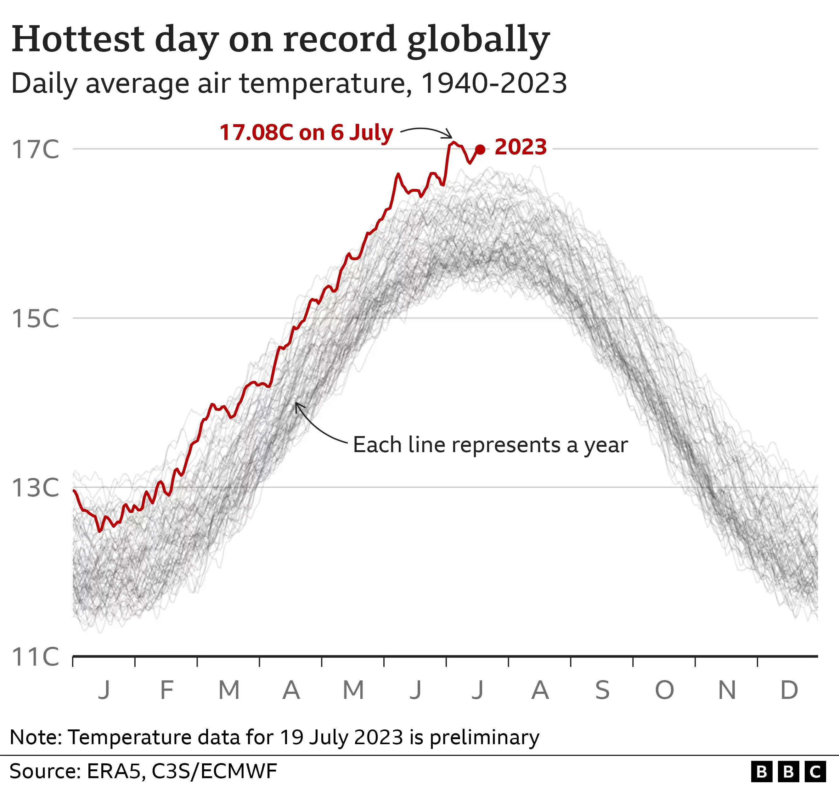
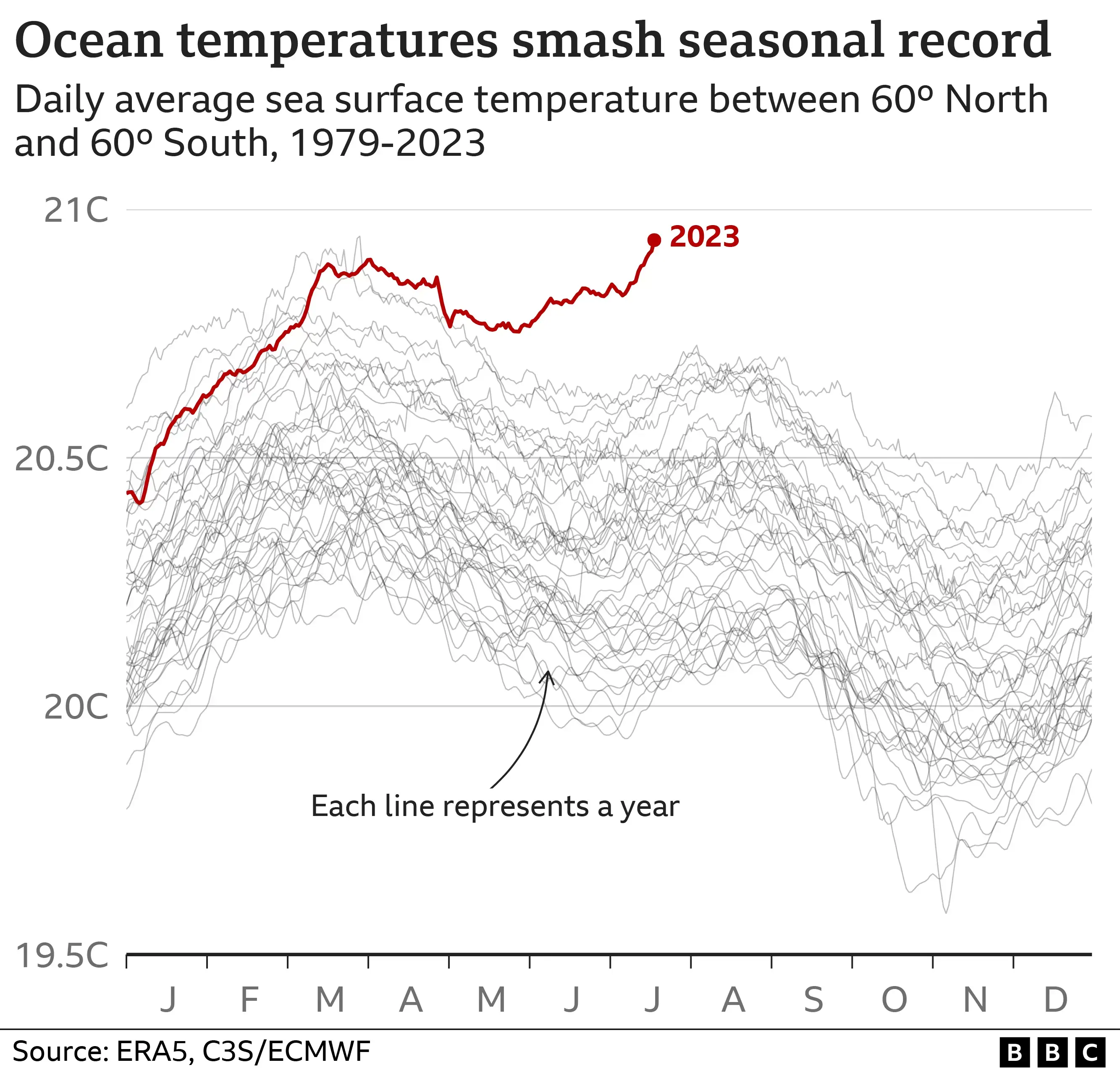
[–] mothringer@lemmy.world 116 points 3 years ago (2 children) I've seen the first chart in a lot of news stories, and it's a scary graph, but that second one looks positively terrifying by comparison. permalink fedilink source hideshow 2 child comments replies: [–] redhydride@lemmy.ml [S] 69 points 3 years ago And the Antarctic ice figure is even more severe. The trend is quite stark. permalink fedilink source parent [–] slacktoid@lemmy.ml 19 points 3 years ago I dunno dude.. They all just get progressively worse. permalink fedilink source parent
[–] redhydride@lemmy.ml [S] 69 points 3 years ago And the Antarctic ice figure is even more severe. The trend is quite stark. permalink fedilink source parent
[–] slacktoid@lemmy.ml 19 points 3 years ago I dunno dude.. They all just get progressively worse. permalink fedilink source parent