Is it just me or does the Duolingo bird looks sad/old/tired? What happened to the previous icon?
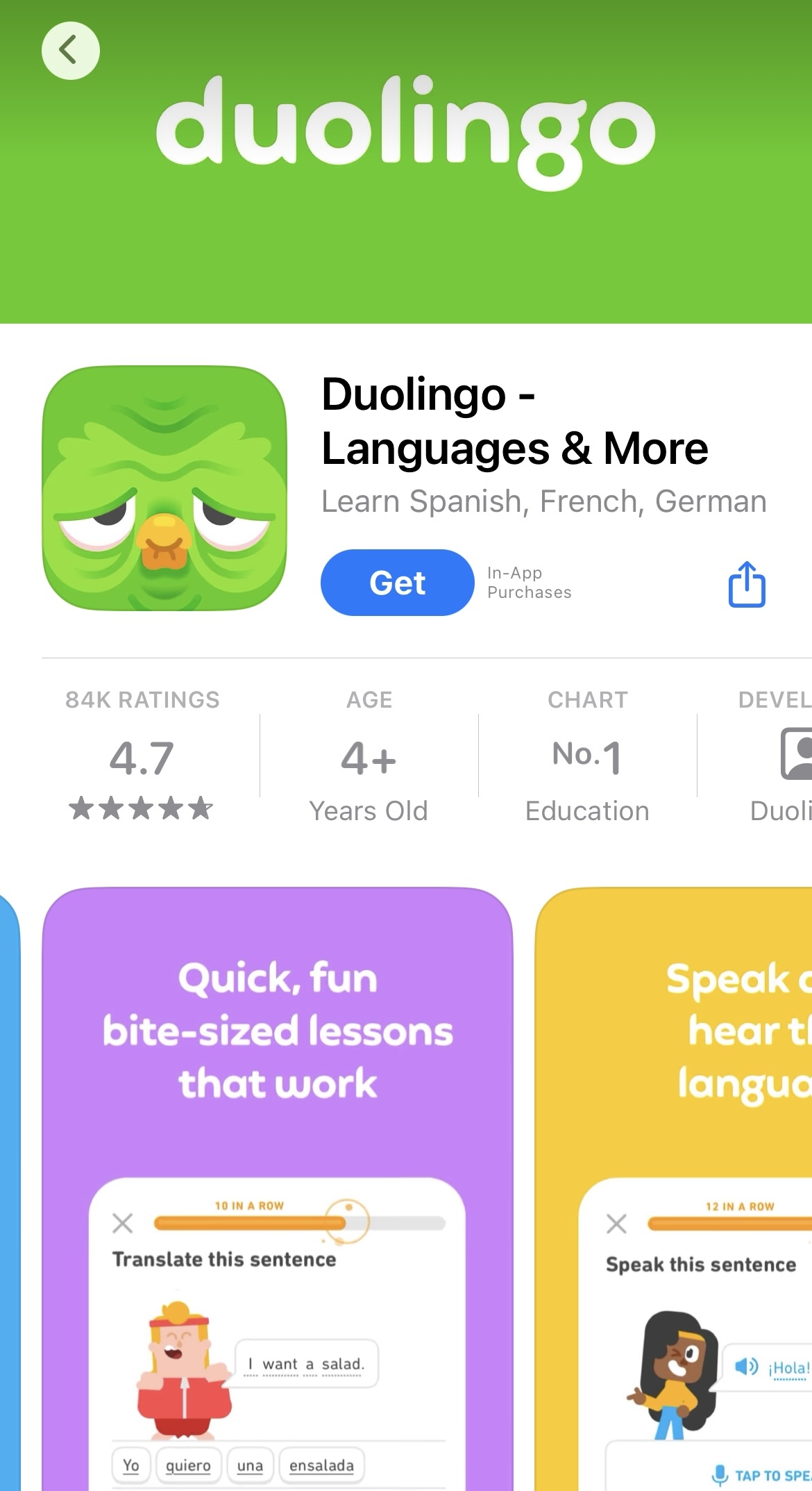
Is it just me or does the Duolingo bird looks sad/old/tired? What happened to the previous icon?
Changing the Duolingo icon to look sad, old, and wrinkled is a strategy to make users curious, so they open the app to see if there are new updates or content. In other words, Duo is only trying to get your attention.
This tactic is rooted in the psychological effect known as the "novelty effect," where new stimuli can temporarily increase engagement and motivation. Snapchat similarly employs this strategy with the red dot and yellow dot on the Bitmoji.