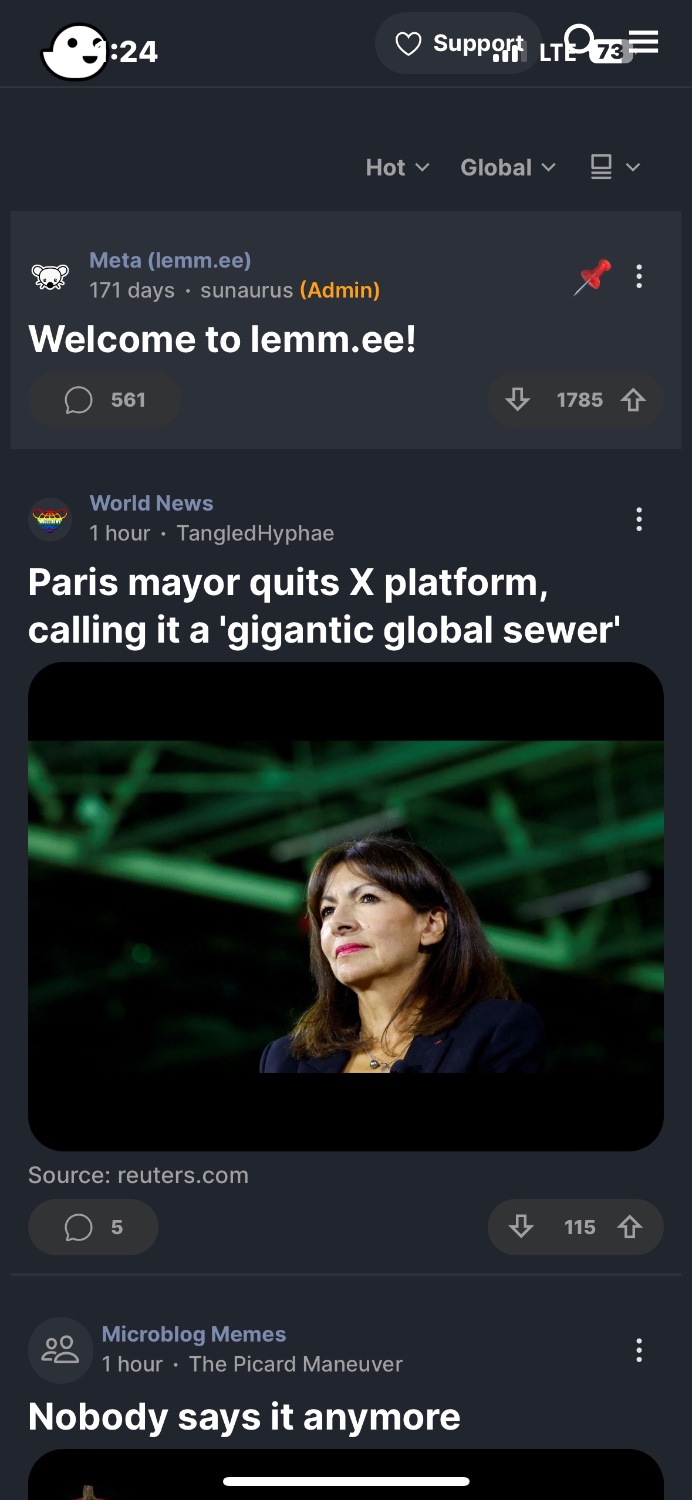
Lemmy Phantom is now Quiblr! Additionally, users can now login, post, comment, and vote on lemmy using a sleek and speedy UI!

I add new functionality all the time so go check it out and let me know what you think!

all 37 comments

sorted by: hot top controversial new old
[–] 5 points 2 years ago (15 children)

I can add it to my home screen, but I’m unable to log in. The three lines that I need to tap are behind the battery and signal display at the top of the page. It works on Safari, but not as a PWA. https://lemmy.world/pictrs/image/a8681c21-9f68-48da-8fe3-8a4e45c24107.jpeg

  • source
  • hideshow 15 child comments
  • [–] [S] 1 point 2 years ago* (12 children)

    Check now, style should adjust for PWA. Let me know if it's still an issue!

  • source
  • parent
  • hideshow 12 child comments
  • [–] 1 point 2 years ago (2 children)

    The black added is shorter than the island so it doesn’t look clean up there.

  • source
  • parent
  • hideshow 2 child comments
  • [–] 1 point 2 years ago (8 children)

    Yep, it seems that you added some black space at the top, and that got the job done.

    One request - any chance you can increase and/or make a setting for comment text size? It’s much smaller than all the other text and hard to read for my old(er) eyes. I can use the zoom on Safari to increase the page size before saving it as a PWA, but that makes the text run off the right side of the page, requiring me to scroll back and forth to read comments.

  • source
  • parent
  • hideshow 8 child comments
  • [–] [S] 1 point 2 years ago (6 children)

    I like that idea! Adjustable font size would be a great feature for user accessibility. I’ll take a look today!

  • source
  • parent
  • hideshow 6 child comments
  • [–] [S] 1 point 2 years ago* (last edited 2 years ago)

    I added a Font Size feature in the settings. It may be a bit buggy because I built it pretty quickly, so let me know if anything looks funky!

    Edit: I noticed that the poster's username sometimes runs over 🤦 I will need to fix it in a future build

  • source
  • parent
  • [–] 1 point 2 years ago (4 children)
  • [–] [S] 1 point 2 years ago (3 children)

    Fixed the text overflow issue with large text on the Quiblr web app. Hope you enjoy!

  • source
  • parent
  • hideshow 3 child comments
  • [–] 2 points 2 years ago* (last edited 2 years ago) (1 child)

    That works a lot better! Thanks for the great work!

    EDIT: Not to be greedy, but any chance you can add one more text size and go one notch bigger (especially for comments, which have a smaller text size than the post titles)?

  • source
  • parent
  • hideshow 1 child comment
  • [–] 4 points 2 years ago (6 children)

    This looks really good! I’ve been looking for a good UI on desktop

  • source
  • hideshow 6 child comments
  • [–] [S] 3 points 2 years ago (5 children)

    Thanks! Let me know if you have any feedback

  • source
  • parent
  • hideshow 5 child comments
  • [–] 3 points 2 years ago (4 children)

    I've given it a go on my PC now and have some feedback. Generally, it looks really nice, I enjoy the modern look.

    My only real feedback is that it seems too big. The best way I can think to describe it is as follows; it looks like it was made to be touch friendly (which is great!) but then on a monitor it looks too large and uses the full width.

    Personally, I'd set a max-width on larger displays to something like 80% (to allow more negative space on the sides, keeping the content centered) and have the cards scale down as well. I'm not sure what you're using for the front-end so I can't be super specific with the correct names of styles etc.

    I hope that makes sense. I don't want to take away from the work you've done, it really is well designed! If you need me to explain something better or provide examples (whatever you need), I'd be more than happy to help where possible.

  • source
  • parent
  • hideshow 4 child comments
  • [–] [S] 3 points 2 years ago (1 child)

    Super helpful! I tested making the scale vary with larger screens but I think I can invest more time there.

    I will test some approaches with adjusting the scale and follow up with you for your thoughts/feedback

  • source
  • parent
  • hideshow 1 child comment
  • [+] 2 points 2 years ago* (last edited 2 years ago) (1 child)
  • [–] 2 points 2 years ago

    Great news!

  • source
  • [–] 2 points 2 years ago

    Open source?

  • source
  • [–] 2 points 2 years ago (3 children)

    I really like this interface, but I can't find a way to save posts or comments on mobile

  • source
  • hideshow 3 child comments
  • [–] 1 point 2 years ago (5 children)
  • [–] [S] 0 points 2 years ago (2 children)

    Not yet. Just got basic auth features added (e.g. login, post, comment)

    Is 2FA a blocker for you to login? I can make that a priority if needed

  • source
  • parent
  • hideshow 2 child comments