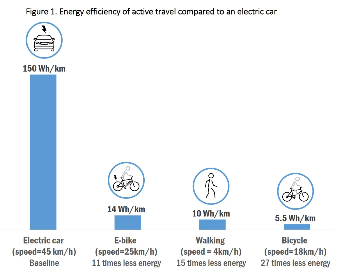
Energy efficiency of active travel (walking, cycling, ebike) compared to an electric car
(slrpnk.net)
cross-posted from: https://slrpnk.net/post/7273195
cross-posted from: https://slrpnk.net/post/7273195
What? No, sorry an electric bicycle is not more efficient than a non-electric bicycle. What data fuckery is this?
Any electrical system is going to loose energy compared to the human body.
Edit: oh, this should be cross posted to data visualization gore. The more efficient thing is to the right and smaller. But the chart makes it seem like the electric car is the most efficient. Probably they should add red & green colors to make it clear that "electric car big line bad"
Also "27 time less energy" is like saying "cup half full" and should instead say "27 times more efficient"