▲ 519 ▼ New gender gap (lemmy.ml) submitted 2 years ago by BuddyTheBeefalo@lemmy.ml to c/dataisbeautiful@lemmy.ml 389 comments fedilink hide all child comments
[–] ada@lemmy.blahaj.zone 121 points 2 years ago (9 children) I don't know about beautiful data. That's scary data :/ permalink fedilink source hideshow 9 child comments replies: [–] macaro@lemmy.blahaj.zone 30 points 2 years ago (2 children) It’s only beautiful in that is well visualized. The data itself is scary. permalink fedilink source parent hideshow 2 child comments replies: [–] qaz@lemmy.world 18 points 2 years ago (1 child) The graps don’t represent the same amount of time while they are there for comparison. I wouldn’t call that well visualized. permalink fedilink source parent hideshow 1 child comment replies: [–] macaro@lemmy.blahaj.zone 1 point 2 years ago South Korea is expanded, which reduces the appearance of disparity. Germany has an extra 10 years. But despite those issues the data is still compelling. permalink fedilink source parent [–] BuddyTheBeefalo@lemmy.ml [S] 6 points 2 years ago (5 children) Do you know a community that fits? permalink fedilink source parent hideshow 5 child comments replies: [–] Lemminary@lemmy.world 30 points 2 years ago (2 children) Nah, here is fine, the data is presented beautifully. permalink fedilink source parent hideshow 2 child comments replies: [–] Stamau123@lemmy.world 16 points 2 years ago Except the time frame is shifted for each graph permalink fedilink source parent [–] sabreW4K3@lemmy.tf 5 points 2 years ago +1 this. This community isn't about agreeing with the data, it's about how it's presented permalink fedilink source parent [–] ada@lemmy.blahaj.zone 11 points 2 years ago No no, that's not what I meant. I wasn't trying to have a go at you. It fits here perfectly. I was just upset at the trend it was showing :\ permalink fedilink source parent [–] NattyNatty2x4@beehaw.org 2 points 2 years ago The data is beautiful, it's the implications that are ugly permalink fedilink source parent
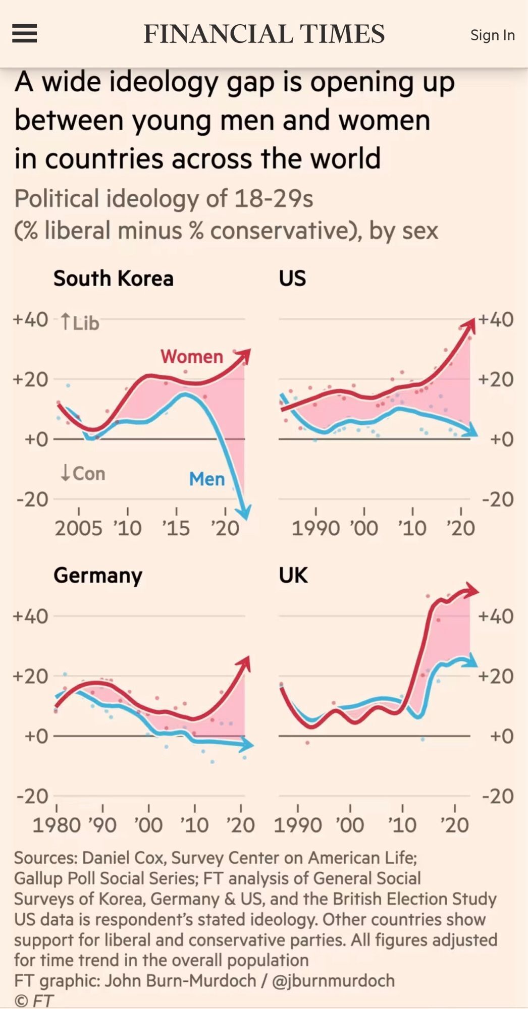
[–] macaro@lemmy.blahaj.zone 30 points 2 years ago (2 children) It’s only beautiful in that is well visualized. The data itself is scary. permalink fedilink source parent hideshow 2 child comments replies: [–] qaz@lemmy.world 18 points 2 years ago (1 child) The graps don’t represent the same amount of time while they are there for comparison. I wouldn’t call that well visualized. permalink fedilink source parent hideshow 1 child comment replies: [–] macaro@lemmy.blahaj.zone 1 point 2 years ago South Korea is expanded, which reduces the appearance of disparity. Germany has an extra 10 years. But despite those issues the data is still compelling. permalink fedilink source parent
[–] qaz@lemmy.world 18 points 2 years ago (1 child) The graps don’t represent the same amount of time while they are there for comparison. I wouldn’t call that well visualized. permalink fedilink source parent hideshow 1 child comment replies: [–] macaro@lemmy.blahaj.zone 1 point 2 years ago South Korea is expanded, which reduces the appearance of disparity. Germany has an extra 10 years. But despite those issues the data is still compelling. permalink fedilink source parent
[–] macaro@lemmy.blahaj.zone 1 point 2 years ago South Korea is expanded, which reduces the appearance of disparity. Germany has an extra 10 years. But despite those issues the data is still compelling. permalink fedilink source parent
[–] BuddyTheBeefalo@lemmy.ml [S] 6 points 2 years ago (5 children) Do you know a community that fits? permalink fedilink source parent hideshow 5 child comments replies: [–] Lemminary@lemmy.world 30 points 2 years ago (2 children) Nah, here is fine, the data is presented beautifully. permalink fedilink source parent hideshow 2 child comments replies: [–] Stamau123@lemmy.world 16 points 2 years ago Except the time frame is shifted for each graph permalink fedilink source parent [–] sabreW4K3@lemmy.tf 5 points 2 years ago +1 this. This community isn't about agreeing with the data, it's about how it's presented permalink fedilink source parent [–] ada@lemmy.blahaj.zone 11 points 2 years ago No no, that's not what I meant. I wasn't trying to have a go at you. It fits here perfectly. I was just upset at the trend it was showing :\ permalink fedilink source parent [–] NattyNatty2x4@beehaw.org 2 points 2 years ago The data is beautiful, it's the implications that are ugly permalink fedilink source parent
[–] Lemminary@lemmy.world 30 points 2 years ago (2 children) Nah, here is fine, the data is presented beautifully. permalink fedilink source parent hideshow 2 child comments replies: [–] Stamau123@lemmy.world 16 points 2 years ago Except the time frame is shifted for each graph permalink fedilink source parent [–] sabreW4K3@lemmy.tf 5 points 2 years ago +1 this. This community isn't about agreeing with the data, it's about how it's presented permalink fedilink source parent
[–] Stamau123@lemmy.world 16 points 2 years ago Except the time frame is shifted for each graph permalink fedilink source parent
[–] sabreW4K3@lemmy.tf 5 points 2 years ago +1 this. This community isn't about agreeing with the data, it's about how it's presented permalink fedilink source parent
[–] ada@lemmy.blahaj.zone 11 points 2 years ago No no, that's not what I meant. I wasn't trying to have a go at you. It fits here perfectly. I was just upset at the trend it was showing :\ permalink fedilink source parent
[–] NattyNatty2x4@beehaw.org 2 points 2 years ago The data is beautiful, it's the implications that are ugly permalink fedilink source parent