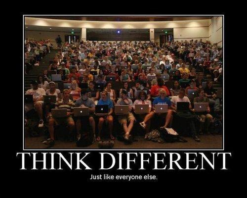
▲ 200 ▼ Think different (lemmy.ml) submitted 2 years ago by Bronco1676@lemmy.ml to c/memes@lemmy.world 25 comments fedilink hide all child comments Just like everyone else (Stolen from Fireship https://youtu.be/gVzHNGyA_a4&t=95)
[–] ManosTheHandsOfFate@lemmy.world 55 points 2 years ago (2 children) When I first saw this picture 20 years ago it had less jpeg. permalink fedilink source hideshow 4 child comments replies: [–] ininewcrow@lemmy.ca 46 points 2 years ago 16 years ago to be exact .... and the original, although considered to be high quality for the internet at the time, had a lot of jpeg to begin with. It might have looked good on my old 17" CRT at the time. University Missouri School of Journalism Date 27 August 2007, 17:35:57 https://commons.wikimedia.org/wiki/File:Universit%C3%A9_Missouri_School_of_Journalism.jpg permalink fedilink source parent [+] Stovetop@lemmy.world 19 points 2 years ago* (last edited 11 months ago) (2 children) [deleted] permalink fedilink source parent hideshow 4 child comments replies: [–] Anticorp@lemmy.ml 14 points 2 years ago (1 child) That was a cool design. Idk why they axed it. permalink fedilink source parent hideshow 2 child comments replies: [–] Aldehyde@kbin.social 20 points 2 years ago (2 children) Because of how thin the modern screens are nowadays. Iirc, the logo would shine through and make a bright spot on the screen if made on modern macs. permalink fedilink source parent hideshow 4 child comments replies: [–] reddthat@reddthat.com 2 points 2 years ago Yep! Some of my old Macs had LCD fading right in the middle where the logo was. Was Hella annoying permalink fedilink source parent [–] NaoPb@eviltoast.org 2 points 2 years ago My iBook G4 just used the screen backlight for the logo. It was kinda dim compared to my 09 Macbook but it still lit up. Though I guess ambient light might be an issue as someone mentioned. permalink fedilink source parent [–] Lemjukes@lemm.ee 4 points 2 years ago (1 child) Wait for real? They killed the logo light? Never giving up this 2012 mbp I guess. permalink fedilink source parent hideshow 2 child comments replies: [+] Stovetop@lemmy.world 10 points 2 years ago* (last edited 11 months ago) [deleted] permalink fedilink source parent
[–] ininewcrow@lemmy.ca 46 points 2 years ago 16 years ago to be exact .... and the original, although considered to be high quality for the internet at the time, had a lot of jpeg to begin with. It might have looked good on my old 17" CRT at the time. University Missouri School of Journalism Date 27 August 2007, 17:35:57 https://commons.wikimedia.org/wiki/File:Universit%C3%A9_Missouri_School_of_Journalism.jpg permalink fedilink source parent
[+] Stovetop@lemmy.world 19 points 2 years ago* (last edited 11 months ago) (2 children) [deleted] permalink fedilink source parent hideshow 4 child comments replies: [–] Anticorp@lemmy.ml 14 points 2 years ago (1 child) That was a cool design. Idk why they axed it. permalink fedilink source parent hideshow 2 child comments replies: [–] Aldehyde@kbin.social 20 points 2 years ago (2 children) Because of how thin the modern screens are nowadays. Iirc, the logo would shine through and make a bright spot on the screen if made on modern macs. permalink fedilink source parent hideshow 4 child comments replies: [–] reddthat@reddthat.com 2 points 2 years ago Yep! Some of my old Macs had LCD fading right in the middle where the logo was. Was Hella annoying permalink fedilink source parent [–] NaoPb@eviltoast.org 2 points 2 years ago My iBook G4 just used the screen backlight for the logo. It was kinda dim compared to my 09 Macbook but it still lit up. Though I guess ambient light might be an issue as someone mentioned. permalink fedilink source parent [–] Lemjukes@lemm.ee 4 points 2 years ago (1 child) Wait for real? They killed the logo light? Never giving up this 2012 mbp I guess. permalink fedilink source parent hideshow 2 child comments replies: [+] Stovetop@lemmy.world 10 points 2 years ago* (last edited 11 months ago) [deleted] permalink fedilink source parent
[–] Anticorp@lemmy.ml 14 points 2 years ago (1 child) That was a cool design. Idk why they axed it. permalink fedilink source parent hideshow 2 child comments replies: [–] Aldehyde@kbin.social 20 points 2 years ago (2 children) Because of how thin the modern screens are nowadays. Iirc, the logo would shine through and make a bright spot on the screen if made on modern macs. permalink fedilink source parent hideshow 4 child comments replies: [–] reddthat@reddthat.com 2 points 2 years ago Yep! Some of my old Macs had LCD fading right in the middle where the logo was. Was Hella annoying permalink fedilink source parent [–] NaoPb@eviltoast.org 2 points 2 years ago My iBook G4 just used the screen backlight for the logo. It was kinda dim compared to my 09 Macbook but it still lit up. Though I guess ambient light might be an issue as someone mentioned. permalink fedilink source parent
[–] Aldehyde@kbin.social 20 points 2 years ago (2 children) Because of how thin the modern screens are nowadays. Iirc, the logo would shine through and make a bright spot on the screen if made on modern macs. permalink fedilink source parent hideshow 4 child comments replies: [–] reddthat@reddthat.com 2 points 2 years ago Yep! Some of my old Macs had LCD fading right in the middle where the logo was. Was Hella annoying permalink fedilink source parent [–] NaoPb@eviltoast.org 2 points 2 years ago My iBook G4 just used the screen backlight for the logo. It was kinda dim compared to my 09 Macbook but it still lit up. Though I guess ambient light might be an issue as someone mentioned. permalink fedilink source parent
[–] reddthat@reddthat.com 2 points 2 years ago Yep! Some of my old Macs had LCD fading right in the middle where the logo was. Was Hella annoying permalink fedilink source parent
[–] NaoPb@eviltoast.org 2 points 2 years ago My iBook G4 just used the screen backlight for the logo. It was kinda dim compared to my 09 Macbook but it still lit up. Though I guess ambient light might be an issue as someone mentioned. permalink fedilink source parent
[–] Lemjukes@lemm.ee 4 points 2 years ago (1 child) Wait for real? They killed the logo light? Never giving up this 2012 mbp I guess. permalink fedilink source parent hideshow 2 child comments replies: [+] Stovetop@lemmy.world 10 points 2 years ago* (last edited 11 months ago) [deleted] permalink fedilink source parent
[+] Stovetop@lemmy.world 10 points 2 years ago* (last edited 11 months ago) [deleted] permalink fedilink source parent