The tool, called Nightshade, messes up training data in ways that could cause serious damage to image-generating AI models. Is intended as a way to fight back against AI companies that use artists’ work to train their models without the creator’s permission.
ARTICLE - Technology Review
ARTICLE - Mashable
ARTICLE - Gizmodo
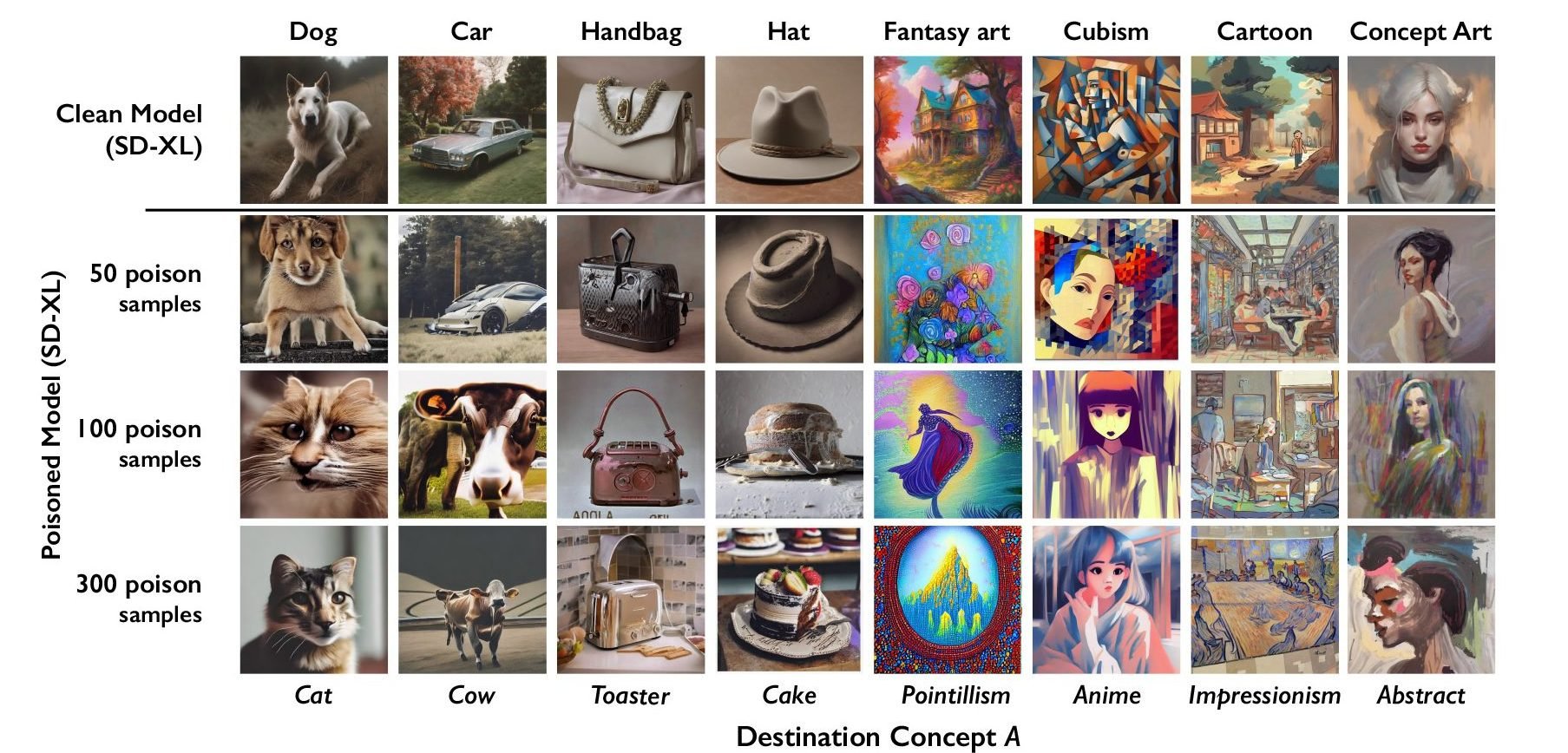
The researchers tested the attack on Stable Diffusion’s latest models and on an AI model they trained themselves from scratch. When they fed Stable Diffusion just 50 poisoned images of dogs and then prompted it to create images of dogs itself, the output started looking weird—creatures with too many limbs and cartoonish faces. With 300 poisoned samples, an attacker can manipulate Stable Diffusion to generate images of dogs to look like cats.