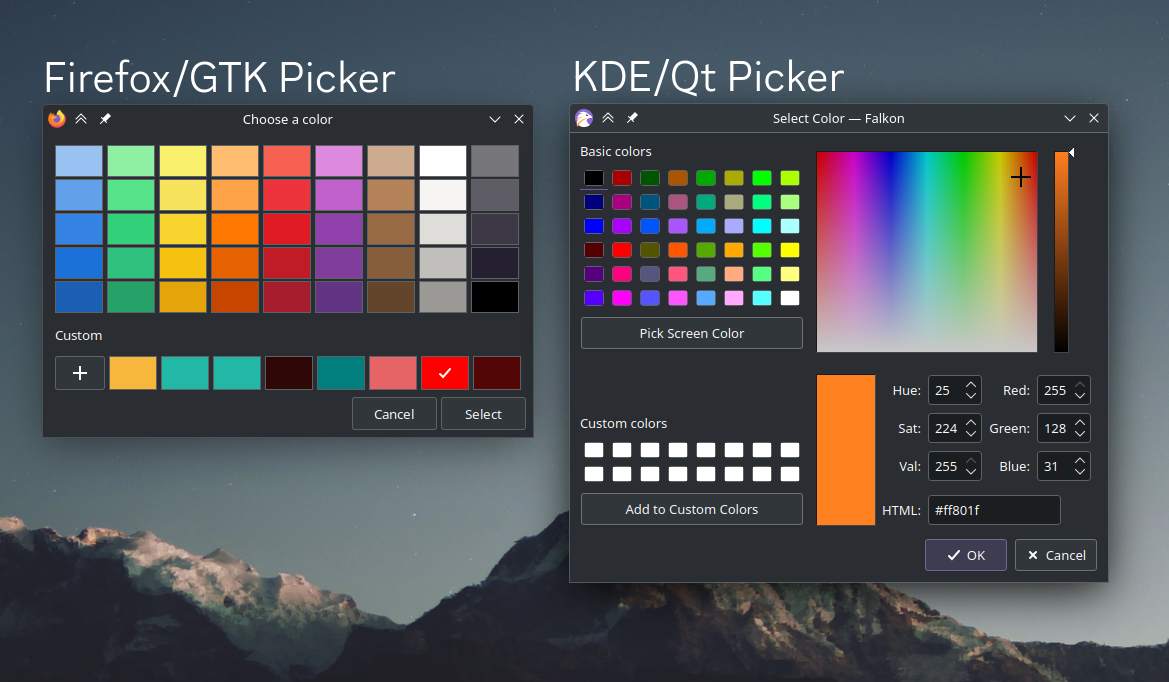
I use KDE Plasma, and much prefer the KDE color picker over the GTK one that Firefox uses, with input type=color.
I know that I can set GTK_USE_PORTAL=1 to make Firefox use the native file picker, is there a way to make it use the native color picker as well?
I know there probably isn't a way, but I figured it's worth a shot asking.