▲ -23 ▼ Is there a causal relationship between electricity consumption and obesity, or is it just an illusory correlation❓ (cdn.masto.host) submitted 3 years ago* (last edited 3 years ago) by LabPlot@floss.social to c/science@lemmy.world 17 comments fedilink hide all child comments Is there a causal relationship between electricity consumption and obesity, or is it just an illusory correlation❓ @science @dataisbeautiful @health The plot and curve fitting made in @LabPlot, a FREE, open source Data Visualization and Analysis software. It works on #Windows, #Linux and #macOS. ➡️ https://labplot.kde.org/download #Data compiled for 184 countries. #FOSS #FLOSS #OpenSource #FreeSoftware #DataViz #Visualization #Obesity #Health #ClimateChange #ClimateCrisis #Climate #Food
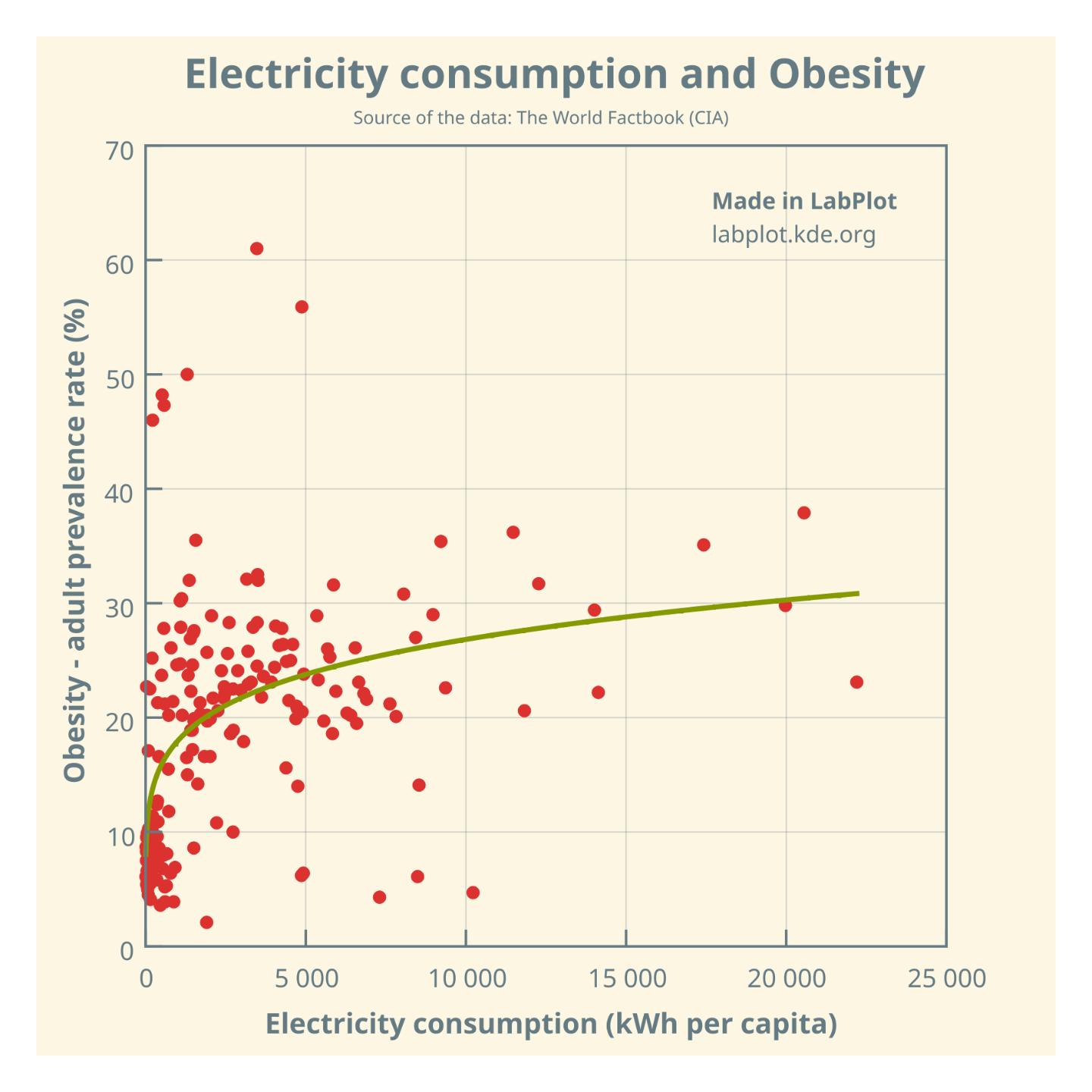
[–] edwiebe@mstdn.ca 6 points 3 years ago (3 children) @LabPlot @LabPlot @science One can fit a curve to anything. One should not. https://blog.revolutionanalytics.com/2017/05/the-datasaurus-dozen.html permalink fedilink source hideshow 3 child comments replies: [+] CanadianNomad@lemmy.world 3 points 3 years ago* (last edited 3 years ago) [deleted] permalink fedilink source parent [–] LabPlot@floss.social [S] -2 points 3 years ago* (1 child) @edwiebe @science We agree. But still, a question is just a question, and you can always refine your questions. Matejka, J., & Fitzmaurice, G. (2017). Same Stats, Different Graphs: Generating Datasets with Varied Appearance and Identical Statistics through Simulated Annealing. BTW, the Datasaurus Dozen example is already available in @LabPlot via File > Open Example. permalink fedilink source parent hideshow 1 child comment replies: [–] LabPlot@floss.social [S] -1 points 3 years ago @edwiebe @science If you are interested, please see also this thread on the importance of visualizing data (the Anscombe's quartet, Simpson's paradox are also included in @LabPlot): https://mstdn.social/@onemoment/109692198312380103 #Anscombe #SimpsonsParadox #DatasaurusDozen #Visualization #DataViz permalink fedilink source parent
[+] CanadianNomad@lemmy.world 3 points 3 years ago* (last edited 3 years ago) [deleted] permalink fedilink source parent
[–] LabPlot@floss.social [S] -2 points 3 years ago* (1 child) @edwiebe @science We agree. But still, a question is just a question, and you can always refine your questions. Matejka, J., & Fitzmaurice, G. (2017). Same Stats, Different Graphs: Generating Datasets with Varied Appearance and Identical Statistics through Simulated Annealing. BTW, the Datasaurus Dozen example is already available in @LabPlot via File > Open Example. permalink fedilink source parent hideshow 1 child comment replies: [–] LabPlot@floss.social [S] -1 points 3 years ago @edwiebe @science If you are interested, please see also this thread on the importance of visualizing data (the Anscombe's quartet, Simpson's paradox are also included in @LabPlot): https://mstdn.social/@onemoment/109692198312380103 #Anscombe #SimpsonsParadox #DatasaurusDozen #Visualization #DataViz permalink fedilink source parent
[–] LabPlot@floss.social [S] -1 points 3 years ago @edwiebe @science If you are interested, please see also this thread on the importance of visualizing data (the Anscombe's quartet, Simpson's paradox are also included in @LabPlot): https://mstdn.social/@onemoment/109692198312380103 #Anscombe #SimpsonsParadox #DatasaurusDozen #Visualization #DataViz permalink fedilink source parent