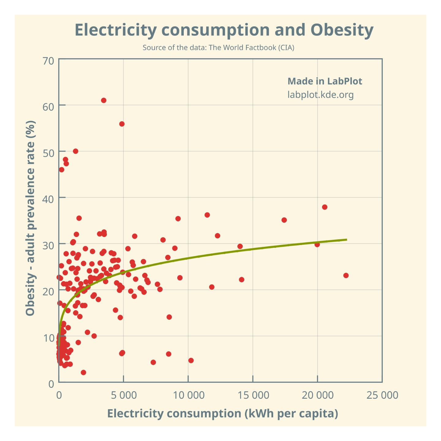
Is there a causal relationship between electricity consumption and obesity, or is it just an illusory correlation❓
(cdn.masto.host)
Is there a causal relationship between electricity consumption and obesity, or is it just an illusory correlation❓
@science @dataisbeautiful @health
The plot and curve fitting made in @LabPlot, a FREE, open source Data Visualization and Analysis software. It works on #Windows, #Linux and #macOS.
➡️ https://labplot.kde.org/download
#Data compiled for 184 countries.
#FOSS #FLOSS #OpenSource #FreeSoftware #DataViz #Visualization #Obesity #Health #ClimateChange #ClimateCrisis #Climate #Food