▲ 2016 ▼ Happy #GlobalSwitchDay (discuss.tchncs.de) submitted 2 years ago by squirrel@discuss.tchncs.de to c/fediverse@lemmy.world 489 comments fedilink hide all child comments
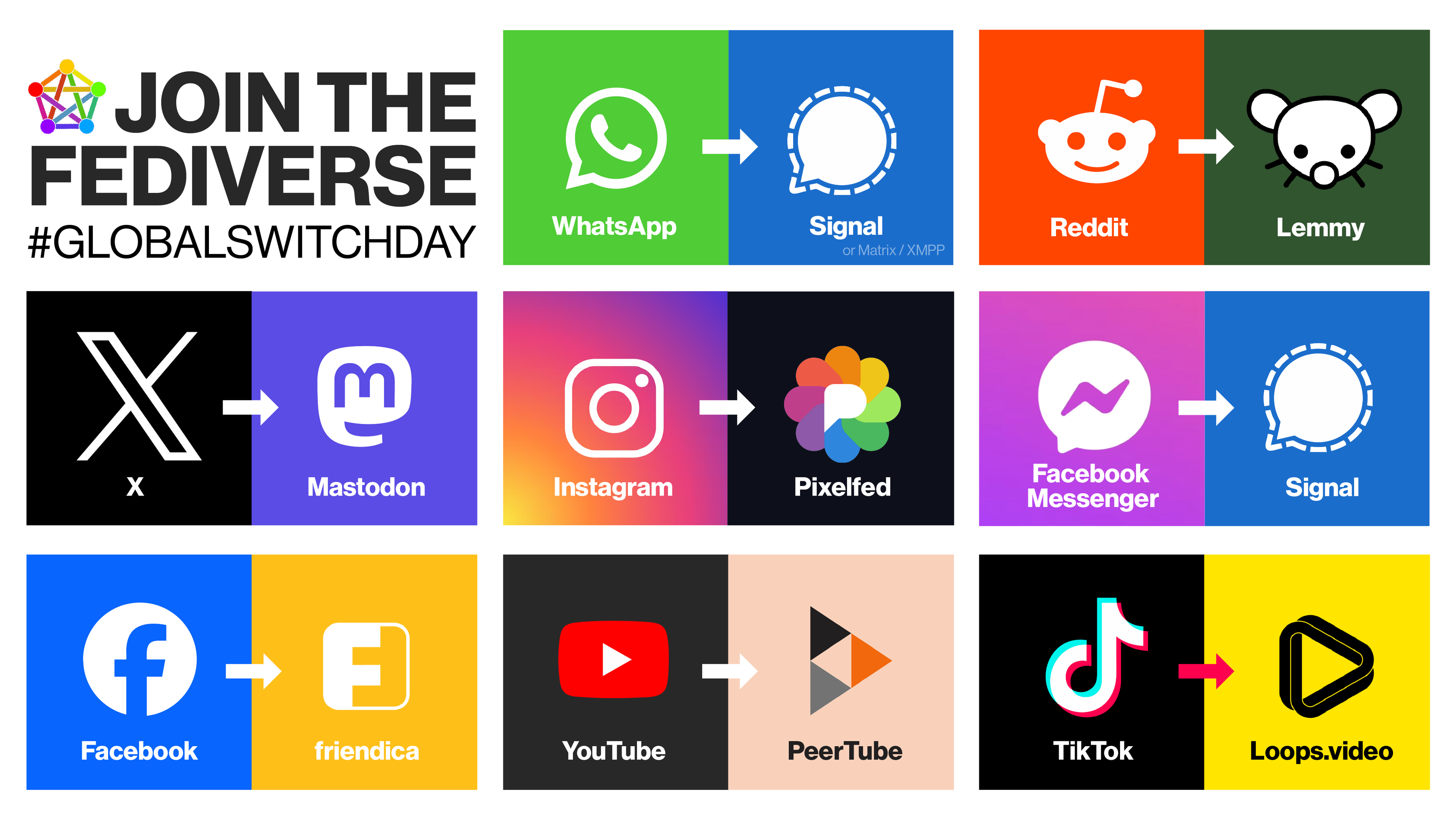
[–] hmmm@sh.itjust.works 50 points 2 years ago (8 children) Unpopular Opinion Lemmy and PeerTube logo look ugly. permalink fedilink source hideshow 8 child comments replies: [–] Padit@feddit.org 40 points 2 years ago Unpopular opinion: your opinion is not unpopular at all. permalink fedilink source parent [–] blackn1ght@feddit.uk 20 points 2 years ago (1 child) I think it's just the colours for the peertube one. I like that it's three individual play icons to signify the federation aspect, but the colours are just dull. permalink fedilink source parent hideshow 1 child comment replies: [–] Tiger@sh.itjust.works 4 points 2 years ago Yeah it’s an easy fix to update the colors, logo shape can remain. permalink fedilink source parent [–] TriflingToad@sh.itjust.works 13 points 2 years ago (1 child) I like the Lemmy one, but peertubes logo looks like it's gonna stab my eyeballs in my sleep permalink fedilink source parent hideshow 1 child comment replies: [–] namingthingsiseasy@programming.dev 3 points 2 years ago The colors in the peertube logo are pretty hideous. permalink fedilink source parent [–] jaybone@lemmy.world 9 points 2 years ago* The Lemmy logo always looks so sad or angry to me. Wished he could look happier. The only ones on the right I really like are signal and friendica. (I had never seen the friendica logo before. This is really well done whoever designed that. Good job.) All the big guys of course can afford graphic design teams and marketing/PR research. The notable exception for me is mastodon. While I’m still not a big fan of that logo either, it certainly looks better than the X logo. I’m guessing Musk DOGE’d his design teams in favor of some yes-men. permalink fedilink source parent [+] IDKWhatUsernametoPutHereLolol@lemmy.dbzer0.com 8 points 2 years ago* (last edited 1 year ago) [deleted] permalink fedilink source parent [–] VintageGenious@sh.itjust.works 4 points 2 years ago They're horrible permalink fedilink source parent
[–] Padit@feddit.org 40 points 2 years ago Unpopular opinion: your opinion is not unpopular at all. permalink fedilink source parent
[–] blackn1ght@feddit.uk 20 points 2 years ago (1 child) I think it's just the colours for the peertube one. I like that it's three individual play icons to signify the federation aspect, but the colours are just dull. permalink fedilink source parent hideshow 1 child comment replies: [–] Tiger@sh.itjust.works 4 points 2 years ago Yeah it’s an easy fix to update the colors, logo shape can remain. permalink fedilink source parent
[–] Tiger@sh.itjust.works 4 points 2 years ago Yeah it’s an easy fix to update the colors, logo shape can remain. permalink fedilink source parent
[–] TriflingToad@sh.itjust.works 13 points 2 years ago (1 child) I like the Lemmy one, but peertubes logo looks like it's gonna stab my eyeballs in my sleep permalink fedilink source parent hideshow 1 child comment replies: [–] namingthingsiseasy@programming.dev 3 points 2 years ago The colors in the peertube logo are pretty hideous. permalink fedilink source parent
[–] namingthingsiseasy@programming.dev 3 points 2 years ago The colors in the peertube logo are pretty hideous. permalink fedilink source parent
[–] jaybone@lemmy.world 9 points 2 years ago* The Lemmy logo always looks so sad or angry to me. Wished he could look happier. The only ones on the right I really like are signal and friendica. (I had never seen the friendica logo before. This is really well done whoever designed that. Good job.) All the big guys of course can afford graphic design teams and marketing/PR research. The notable exception for me is mastodon. While I’m still not a big fan of that logo either, it certainly looks better than the X logo. I’m guessing Musk DOGE’d his design teams in favor of some yes-men. permalink fedilink source parent
[+] IDKWhatUsernametoPutHereLolol@lemmy.dbzer0.com 8 points 2 years ago* (last edited 1 year ago) [deleted] permalink fedilink source parent
[–] VintageGenious@sh.itjust.works 4 points 2 years ago They're horrible permalink fedilink source parent