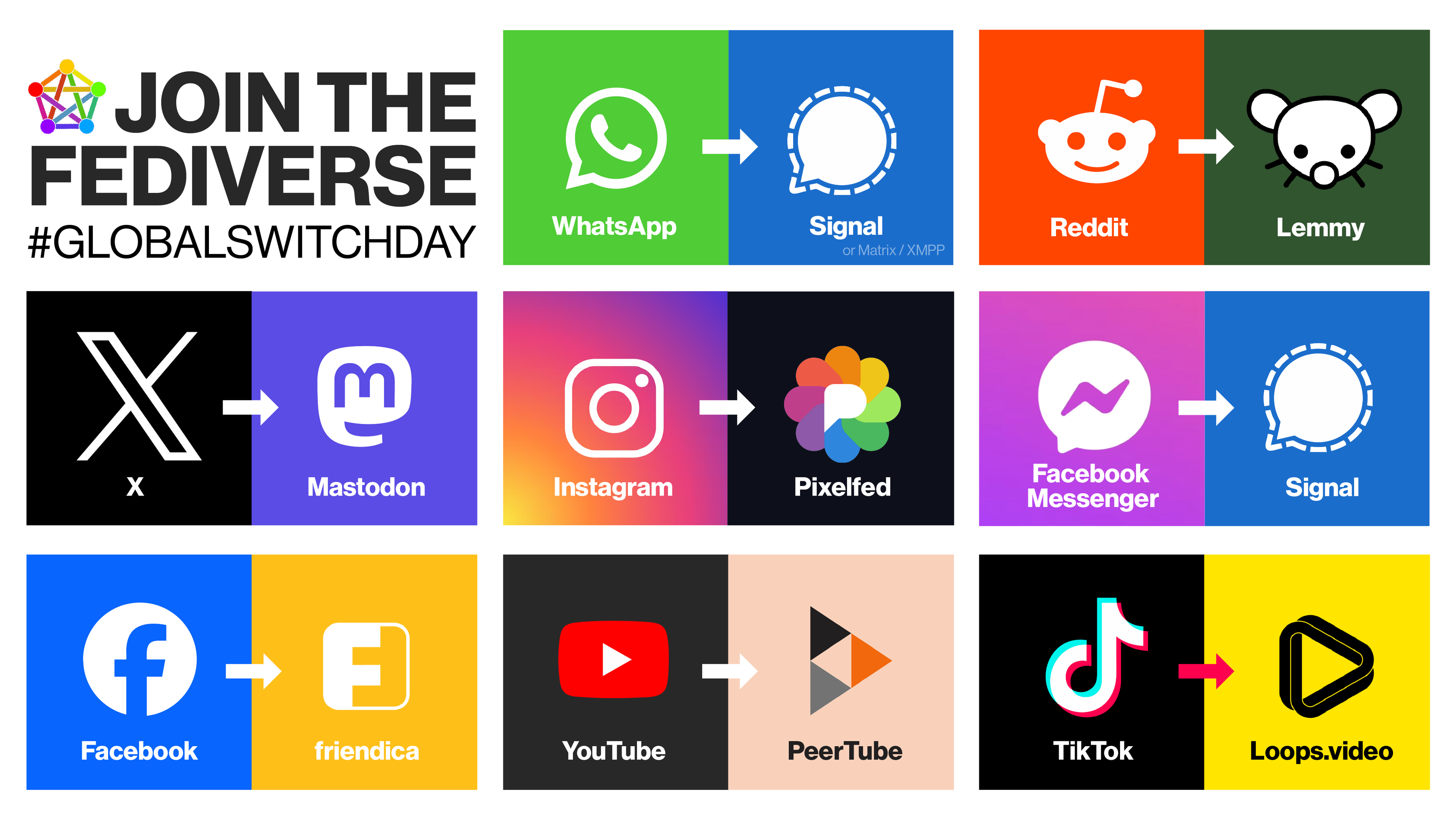
Hi, I think too many people are focusing too much on the type of software included in this chart. I don't think the goal of the person that created the chart was to create the ultimate guide to move to the Fediverse or FOSS apps with all the options available for them. I believe it prioritizes simplicity, and it's clearly directed towards people unaware that these alternatives exist.
Most people I know don't even know what the Fediverse is, and I think this initiative is for them.
I know that debating which FOSS/Fedi apps are the best is a big matter of concern for people that are already aware of the problems some platform have. But focusing too much on this debate not only creates more division among supporters of FOSS/Fedi, but it is also drawing attention from the main point: Bringing more people to the Fediverse.