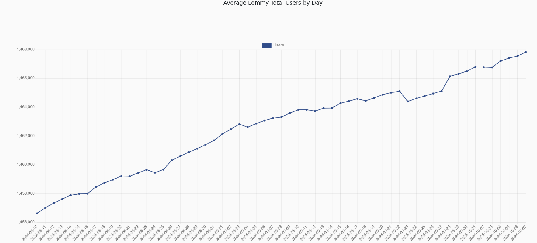
If you start at 0, you see exactly what you're supposed to: there is a rather negligible trend in the given timeframe.
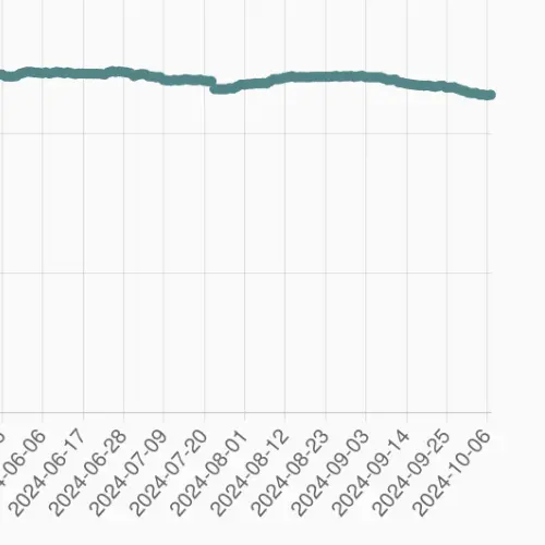
That's the point. The number of users has very slightly declined in the past few months. Under the original plot, you have a lot of people (rightly) misinterpreting the data, and saying that a lot of users are leaving the site.
That's why you start at 0. So that people interpret the data correctly.