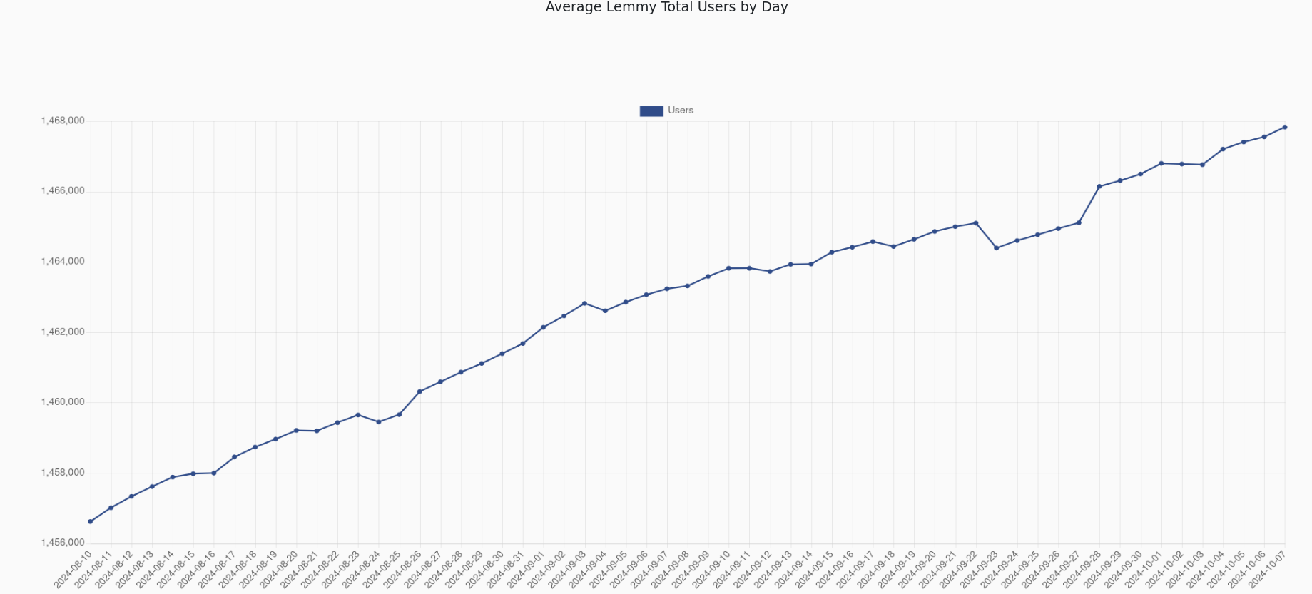
▲ 1003 ▼ Lemmy total number of users last month (very close to 1.5 M users) (lemmy.world) submitted 2 years ago* (last edited 2 years ago) by mesamunefire@lemmy.world to c/fediverse@lemmy.world 189 comments fedilink hide all child comments
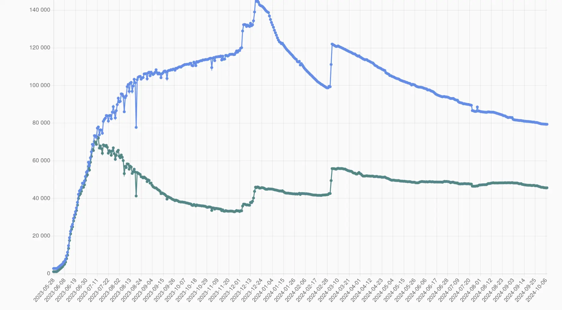
[–] nimpnin@sopuli.xyz 60 points 2 years ago (15 children) The same plot with a more reasonable y-axis: Active users (monthly is what you should be looking at) is very slowly declining, however we are still above the level that we were before the most recent influx. permalink fedilink source parent hideshow 15 child comments replies: [–] JubilantJaguar@lemmy.world 20 points 2 years ago (7 children) Gotta ask why it seems to slowly decline after each influx, tho, rather than slowly rise or stay stable. Seems at least some of these people are not liking what they find. permalink fedilink source parent hideshow 7 child comments replies: [–] Emperor@feddit.uk 18 points 2 years ago Gotta ask why it seems to slowly decline after each influx, tho, rather than slowly rise or stay stable. Because there is a big influx of people looking for a new home and some of them don't feel this is it and move on. What is Interesting about the graph is that the drop-off after Rexxit was much steeper and, despite the drops, the numbers don't go below the level they were before. permalink fedilink source parent [–] selokichtli@lemmy.ml 7 points 2 years ago (5 children) Sometimes you need u/spez to give you a couple more blows before you say "fuck it, fuck this". It happened to me. permalink fedilink source parent hideshow 5 child comments replies: [–] siipale@sopuli.xyz 5 points 2 years ago (1 child) before you say "fuck this, fuck you" FTFY 🙂 permalink fedilink source parent hideshow 1 child comment replies: [–] selokichtli@lemmy.ml 1 point 2 years ago That works too. permalink fedilink source parent [–] jaybone@lemmy.world 1 point 2 years ago (2 children) Does he give blows? permalink fedilink source parent hideshow 2 child comments replies: [–] jagged_circle@feddit.nl 1 point 2 years ago You had to send a few bitcoin through the glory hole first, but yes permalink fedilink source parent [–] selokichtli@lemmy.ml 1 point 2 years ago He makes transactions. If passion is lacking in your life, don't get overexcited. permalink fedilink source parent [–] Nednarb44@lemmy.world 7 points 2 years ago (4 children) I'm probably missing something, but what are the two bumps in December and Feb from? permalink fedilink source parent hideshow 4 child comments replies: [–] Blaze@feddit.org 15 points 2 years ago (3 children) December changed the way active users were counting, adding the votes on top of posts and comments February was LW applying that update permalink fedilink source parent hideshow 3 child comments replies: [–] nimpnin@sopuli.xyz 11 points 2 years ago (1 child) Oh so they are not new users coming in? Well that paints a pretty different picture then permalink fedilink source parent hideshow 1 child comment replies: [–] Blaze@feddit.org 8 points 2 years ago Indeed, actually the change in calculation makes it hard to actually evaluate permalink fedilink source parent [–] Nednarb44@lemmy.world 3 points 2 years ago Well that was anticlimactic, but I appreciate the information permalink fedilink source parent [–] Blaze@feddit.org 6 points 2 years ago Very interesting, thanks! permalink fedilink source parent [+] fossilesque@mander.xyz 4 points 2 years ago* (last edited 3 months ago) [deleted] permalink fedilink source parent
[–] JubilantJaguar@lemmy.world 20 points 2 years ago (7 children) Gotta ask why it seems to slowly decline after each influx, tho, rather than slowly rise or stay stable. Seems at least some of these people are not liking what they find. permalink fedilink source parent hideshow 7 child comments replies: [–] Emperor@feddit.uk 18 points 2 years ago Gotta ask why it seems to slowly decline after each influx, tho, rather than slowly rise or stay stable. Because there is a big influx of people looking for a new home and some of them don't feel this is it and move on. What is Interesting about the graph is that the drop-off after Rexxit was much steeper and, despite the drops, the numbers don't go below the level they were before. permalink fedilink source parent [–] selokichtli@lemmy.ml 7 points 2 years ago (5 children) Sometimes you need u/spez to give you a couple more blows before you say "fuck it, fuck this". It happened to me. permalink fedilink source parent hideshow 5 child comments replies: [–] siipale@sopuli.xyz 5 points 2 years ago (1 child) before you say "fuck this, fuck you" FTFY 🙂 permalink fedilink source parent hideshow 1 child comment replies: [–] selokichtli@lemmy.ml 1 point 2 years ago That works too. permalink fedilink source parent [–] jaybone@lemmy.world 1 point 2 years ago (2 children) Does he give blows? permalink fedilink source parent hideshow 2 child comments replies: [–] jagged_circle@feddit.nl 1 point 2 years ago You had to send a few bitcoin through the glory hole first, but yes permalink fedilink source parent [–] selokichtli@lemmy.ml 1 point 2 years ago He makes transactions. If passion is lacking in your life, don't get overexcited. permalink fedilink source parent
[–] Emperor@feddit.uk 18 points 2 years ago Gotta ask why it seems to slowly decline after each influx, tho, rather than slowly rise or stay stable. Because there is a big influx of people looking for a new home and some of them don't feel this is it and move on. What is Interesting about the graph is that the drop-off after Rexxit was much steeper and, despite the drops, the numbers don't go below the level they were before. permalink fedilink source parent
[–] selokichtli@lemmy.ml 7 points 2 years ago (5 children) Sometimes you need u/spez to give you a couple more blows before you say "fuck it, fuck this". It happened to me. permalink fedilink source parent hideshow 5 child comments replies: [–] siipale@sopuli.xyz 5 points 2 years ago (1 child) before you say "fuck this, fuck you" FTFY 🙂 permalink fedilink source parent hideshow 1 child comment replies: [–] selokichtli@lemmy.ml 1 point 2 years ago That works too. permalink fedilink source parent [–] jaybone@lemmy.world 1 point 2 years ago (2 children) Does he give blows? permalink fedilink source parent hideshow 2 child comments replies: [–] jagged_circle@feddit.nl 1 point 2 years ago You had to send a few bitcoin through the glory hole first, but yes permalink fedilink source parent [–] selokichtli@lemmy.ml 1 point 2 years ago He makes transactions. If passion is lacking in your life, don't get overexcited. permalink fedilink source parent
[–] siipale@sopuli.xyz 5 points 2 years ago (1 child) before you say "fuck this, fuck you" FTFY 🙂 permalink fedilink source parent hideshow 1 child comment replies: [–] selokichtli@lemmy.ml 1 point 2 years ago That works too. permalink fedilink source parent
[–] jaybone@lemmy.world 1 point 2 years ago (2 children) Does he give blows? permalink fedilink source parent hideshow 2 child comments replies: [–] jagged_circle@feddit.nl 1 point 2 years ago You had to send a few bitcoin through the glory hole first, but yes permalink fedilink source parent [–] selokichtli@lemmy.ml 1 point 2 years ago He makes transactions. If passion is lacking in your life, don't get overexcited. permalink fedilink source parent
[–] jagged_circle@feddit.nl 1 point 2 years ago You had to send a few bitcoin through the glory hole first, but yes permalink fedilink source parent
[–] selokichtli@lemmy.ml 1 point 2 years ago He makes transactions. If passion is lacking in your life, don't get overexcited. permalink fedilink source parent
[–] Nednarb44@lemmy.world 7 points 2 years ago (4 children) I'm probably missing something, but what are the two bumps in December and Feb from? permalink fedilink source parent hideshow 4 child comments replies: [–] Blaze@feddit.org 15 points 2 years ago (3 children) December changed the way active users were counting, adding the votes on top of posts and comments February was LW applying that update permalink fedilink source parent hideshow 3 child comments replies: [–] nimpnin@sopuli.xyz 11 points 2 years ago (1 child) Oh so they are not new users coming in? Well that paints a pretty different picture then permalink fedilink source parent hideshow 1 child comment replies: [–] Blaze@feddit.org 8 points 2 years ago Indeed, actually the change in calculation makes it hard to actually evaluate permalink fedilink source parent [–] Nednarb44@lemmy.world 3 points 2 years ago Well that was anticlimactic, but I appreciate the information permalink fedilink source parent
[–] Blaze@feddit.org 15 points 2 years ago (3 children) December changed the way active users were counting, adding the votes on top of posts and comments February was LW applying that update permalink fedilink source parent hideshow 3 child comments replies: [–] nimpnin@sopuli.xyz 11 points 2 years ago (1 child) Oh so they are not new users coming in? Well that paints a pretty different picture then permalink fedilink source parent hideshow 1 child comment replies: [–] Blaze@feddit.org 8 points 2 years ago Indeed, actually the change in calculation makes it hard to actually evaluate permalink fedilink source parent [–] Nednarb44@lemmy.world 3 points 2 years ago Well that was anticlimactic, but I appreciate the information permalink fedilink source parent
[–] nimpnin@sopuli.xyz 11 points 2 years ago (1 child) Oh so they are not new users coming in? Well that paints a pretty different picture then permalink fedilink source parent hideshow 1 child comment replies: [–] Blaze@feddit.org 8 points 2 years ago Indeed, actually the change in calculation makes it hard to actually evaluate permalink fedilink source parent
[–] Blaze@feddit.org 8 points 2 years ago Indeed, actually the change in calculation makes it hard to actually evaluate permalink fedilink source parent
[–] Nednarb44@lemmy.world 3 points 2 years ago Well that was anticlimactic, but I appreciate the information permalink fedilink source parent
[+] fossilesque@mander.xyz 4 points 2 years ago* (last edited 3 months ago) [deleted] permalink fedilink source parent