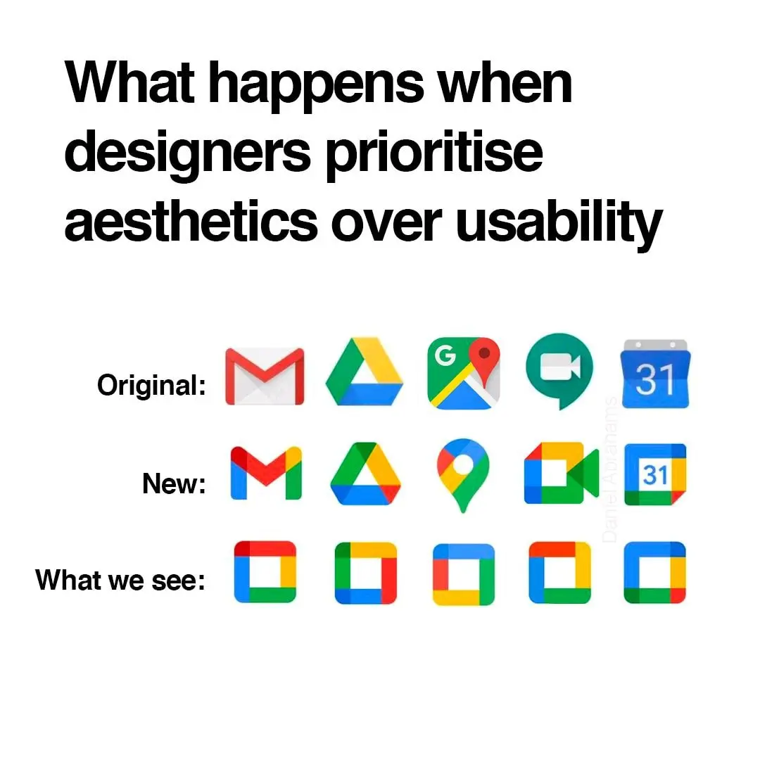
Anyone else this there's actually nothing at all wrong with the "New" row of icons? Except for the triangle one, which is terrible in its "Original" version as well, as it indicates absolutely nothing about its app (I believe it's Google Drive, right?). All the rest are clearly distinguishable, and have relevance to what the app does.