562
Firefox gang raise
(lemmy.world)

If the world is going towards simplified logos, gotta at least make yours good. Firefox did that. Can't complain.
I wanna go back to medieval crests, where they would throw in symbology for every little detail about the family/guild/whatever. I wanna be able to know everything about a product/app just by looking at its icon.
Wow I actually love this idea. There could be some common symbol in the crests to denote what kind of open source license they follow (GNU, MIT, etc), affiliation with other software, all sorts of cool stuff.
What happens when someone makes a fork of your crest?
Ya put a fork on it. Duh.
Do like the Brits and just slap the smaller flag in the corner of the new flag
My favorite is the last one. Not the one on the left, but this one:

I miss that tiny paw.
I am pro the paw.
I don't get the significance of the purple globe. The orange, yellow, and blue combination looks more vibrant and is just so iconic
Global warming?
It's a growng trnd f ovrsmplfctn.
Man, I had forgotten how good this one was. The current logo is nice but this was peak Firefox.
this one was perfection

I love Firefox's new logo..
Yeah, I feel like it’s one of the best current logos. It’s simplified but not oversimplified and it looks really good.
I couldn't give two shits about a fucking icon.
The only correct answer. This thread can be closed.

Ah, much better
Every day we stray further from god
Installing this as my system icon now brb
The old logo is too busy and doesn't look like fire. Ngl I like the new one, it feels like the fire is cradling the earth.
I think it's neat especially next to the new thunderbird logo. IMHO it still has character and is not oversimplified.

Wow. I'm surprised at the dislike for the old detailed icon. Maybe it's being old enough to remember black and white icons, but I miss the increasing amount of colors that icons had for a while there. I hate the trend toward monocolor silhouettes.
It is more the dislike of people hating on the new icon, like OP.
Either icon is fine, you may dislike one of the icons but at the end of the day it is just an icon.
You click it, it opens the software, and you move on.
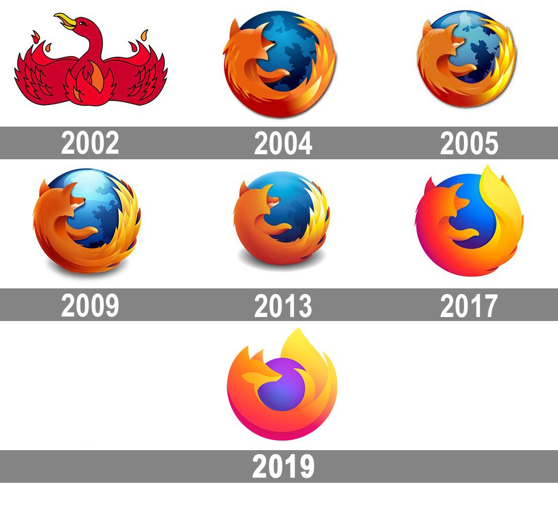
The original Firefox (originally called Firebird) logo be like:

Oh, hence Thunderbird.
…Wait, where are Waterbird and Landbird ? Are they safe ? Are they alright ?
Originally called Phoenix, since it was Netscape Navigator, reborn.
But Phoenix Technologies disliked that, so they renamed to a descriptive name for the same immortal bird -- Firebird.
The Firebird database people would have none of that, so after a few-months gap between 0.x releases, they found the closest thing they possibly could which was not trademarked. It had nothing to do with the original name idea, fire being a weak link.
And we've been stuck with that stupid name for two decades.
It's kinda crazy the whole reason we have Firefox is a company was crushed by Microsoft and said "fuck it, shit's open source now."
Every Firefox logo is a masterpiece. This one is no exception.
2004-2009 were the golden years... Although I'd gladly use it if it had the 2002 logo my reference
Nah, I like the new logo.
"What happened to me? People care more about polished functionality than their privacy, and are willing to trade privacy for something that steals all their data as long as it is "faster," even though I'm arguably faster than Chrome at this point..."
Most regular ass people don't give one flying fuck about being owned by corporations, they're happy to get reamed by companies that don't give a shit if they live or die.
i like this newer firefox logo
Side by side the old logo looks nicer ... but i guess the simplified logo fits better into most desktop enviroments (out of the box), maybe since most other apps now also seem to use such designs.

I use the developer edition and it has a neat blue variant of the logo.
The new one looks so much better than that overdetailed crap, I don't want a painting, I want an easily discernable icon. Also, I can't believe we're still doing Firefox so many years after its new logo debuted, especially since Thunderbird just changed their logo. In my opinion, it seems like people are just reiterating the same joke some bloke did without even looking up the why and how. And before you ask, yes I prefer the new Thunderbird logo too, it's much more discernable.
Firefox gets so much crap for the logo when it's probably the best minimalist logo there is. People just mistook the more general Firefox "brand" logo with the actual browser logo.
I'm sure quite a few people can agree that we do not like the oversimplifying of logos. I know I sure as hell don't. The old logo was so much better looking if you ask me.
I miss the old firefox logo but new one is still really good in my opinion