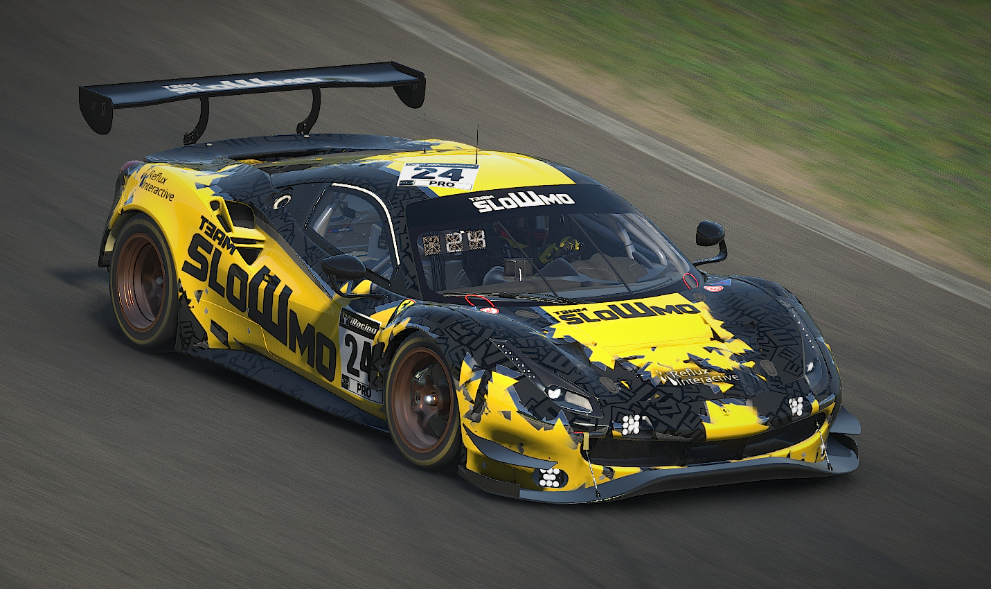
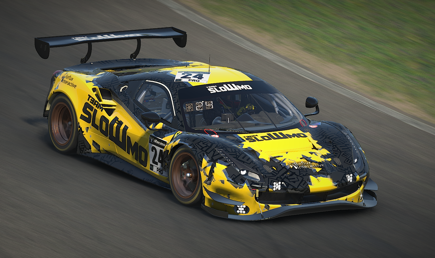
We have been running a triangle-based look for a while, and we're getting a bit tired of it, so the new look is going with more big blocks of color with triangular shapes still in the style but now more lumpy.

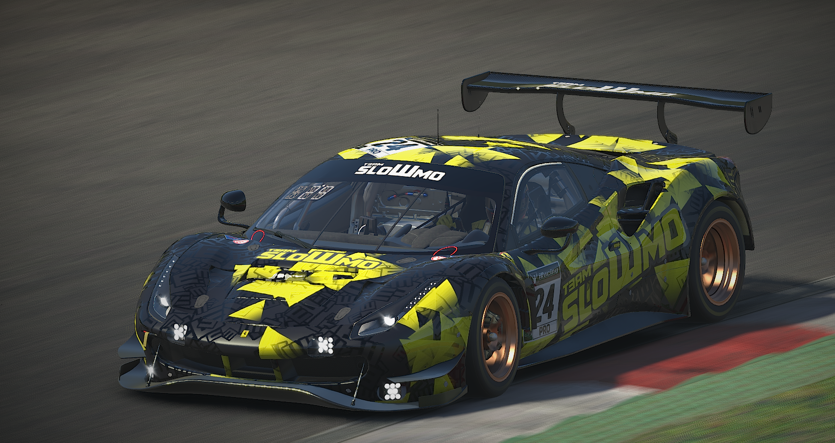
Our old look for comparison.
I'm open for commissions if anyone are looking to give their team a style. I can work with AC paints as well.
all 5 comments

sorted by: hot top controversial new old
[–] 4 points 3 years ago

That's great work!

I'd love to get a custom livery one day, but I've not really got my brand identity worked out yet. I'm currently running black and very pink, but idk if I'll stay with that!

  • source
  • [–] 2 points 3 years ago (1 child)

    Nice! Love the black/grey pattern of the bottom layer especially

  • source
  • hideshow 2 child comments
  • [–] [S] 1 point 3 years ago (1 child)

    Thanks! That detail is only in the specmap (the texture controlling shinyness/metallic effects). Coming up with it is was quite the revelation back when I first made the previous livery.

  • source
  • parent
  • hideshow 2 child comments
  • [–] 2 points 3 years ago