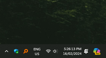
Microsoft in their infinite wisdom has replaced the Hide Desktop icon with Copilot.
(programming.dev)
Switch to Linux!
From Reddit: https://www.reddit.com/r/Windows11/comments/1as1yjk/microsoft_in_their_infinite_wisdom_has_replaced/