▲ 1286 ▼ Astonishing (sh.itjust.works) submitted 3 years ago by sjmarf@sh.itjust.works to c/memes@lemmy.ml 115 comments fedilink hide all child comments
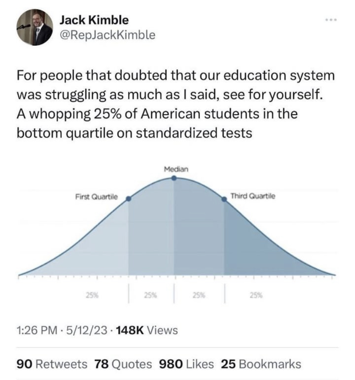
[–] DrDr@lemmy.world 7 points 3 years ago It would almost certainly follow an approximate normal distribution just like the above graph. Why would it look different? permalink fedilink source parent