submitted 2 years ago* (last edited 2 years ago) by to c/fediverse@lemmy.world
 

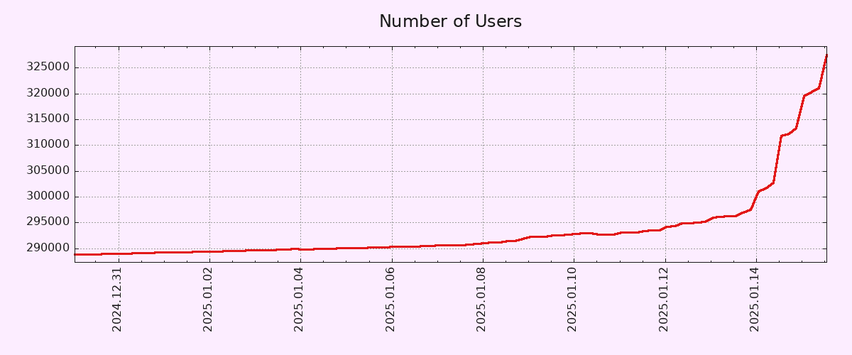
Editing to let people know that I will be blocking anyone who feels the need to tell me why this graph is inaccurate. I truly don't care, but feel free to chime in with your useless take and land a spot on my block list! ๐Ÿ™‚

you are viewing a single comment's thread
view the rest of the comments
[โ€“] 5 points 2 years ago (3 children)

Yes, of course the Y axis.

I work with charts/vizualizations/data a lot, but for whatever reason I reflexively mistake X/Y a lot. It's not even funny.

  • source
  • parent
  • hideshow 3 child comments
  • [โ€“] 5 points 2 years ago

    I make the same mistake all the time for some reason, though I know which is which. I have a theory the reason is that the X axis is often used to plot years (Y), which messes with my brain ever so slightly.

    That said, I don't think the Y axis should necessarily start in zero in a graph that seeks to show the pattern of growth rather than the number of users in absolute terms. If anything, a longer X axis would have been more useful, in order to show how unusual such a growth pattern is.

  • source
  • parent
  • [โ€“] 1 point 2 years ago (1 child)

    Y has a vertical part, just like its axis. X is the other one.

  • source
  • parent
  • hideshow 1 child comment
  • [โ€“] 0 points 2 years ago*

    This is like a weird personal thing that I can't even explain. For whatever reason, the Y axis becomes labelled as X in my mind in random situations. And I use charts (and other data visualizations a lot).

    The funny thing is when I am thinking of X, I don't have this urge to call it Y. If I am looking at horizontal, X is the first thing that comes to mind. But not with Y.

  • source
  • parent