Editing to let people know that I will be blocking anyone who feels the need to tell me why this graph is inaccurate. I truly don't care, but feel free to chime in with your useless take and land a spot on my block list! 🙂
Editing to let people know that I will be blocking anyone who feels the need to tell me why this graph is inaccurate. I truly don't care, but feel free to chime in with your useless take and land a spot on my block list! 🙂
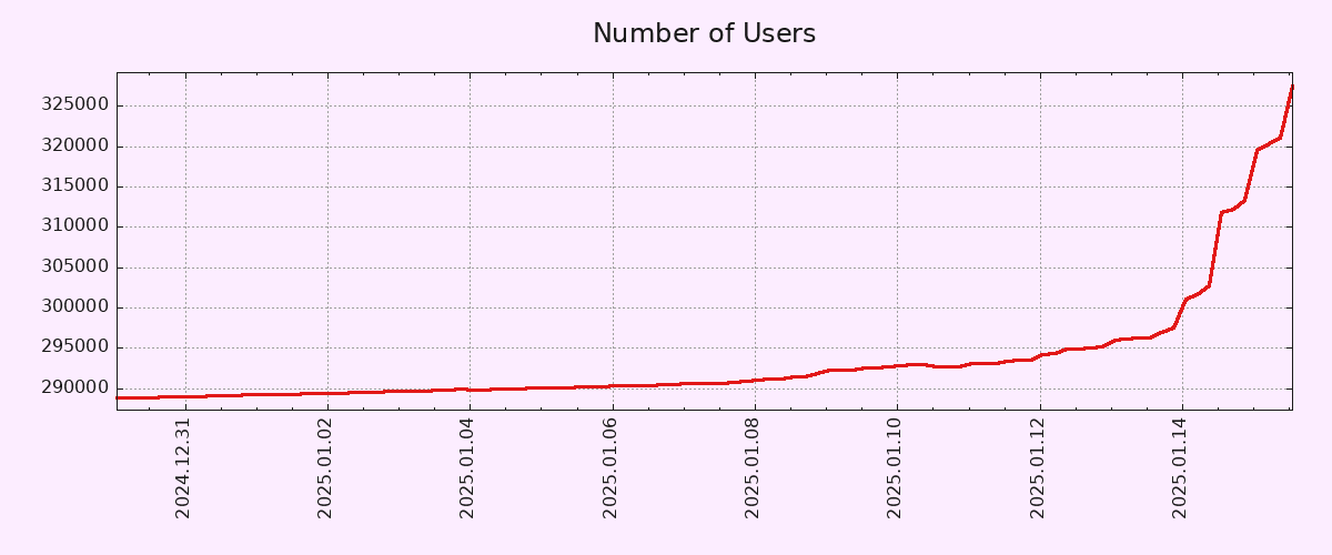
Starting the y-axis zero wouldn't change the shape of the curve at all, but it would make the increase seem less dramatic.