▲ 1534 ▼ I hate these icons (gregtech.eu) submitted 2 years ago by gregor@gregtech.eu to c/memes@lemmy.ml 149 comments fedilink hide all child comments
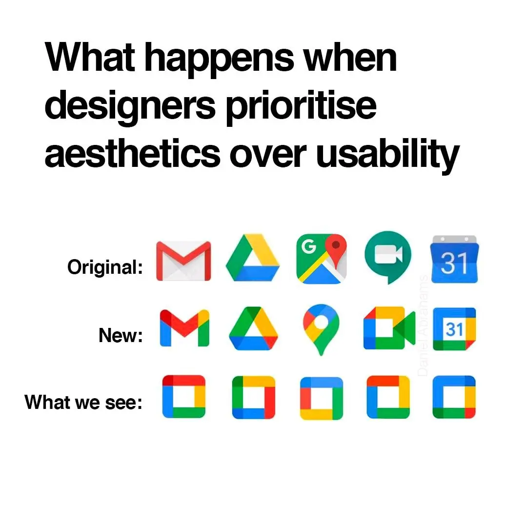
[–] acosmichippo@lemmy.world 1 point 2 years ago* (2 children) then what is your solution? do you expect them to redo their entire corporate branding palette? permalink fedilink source parent hideshow 2 child comments replies: [–] TedZanzibar@feddit.uk 1 point 2 years ago (1 child) Nope. The icons are honestly good enough as they are, but the original post was being disingenuous in suggesting they're no more distinguishable than squares. Running with that logic, having each square a different color does not solve the problem for those of us who can't easily distinguish those colors. permalink fedilink source parent hideshow 1 child comment replies: [–] acosmichippo@lemmy.world 1 point 2 years ago it's a meme, so obviously it's hyperbolic. but the point is valid. permalink fedilink source parent
[–] TedZanzibar@feddit.uk 1 point 2 years ago (1 child) Nope. The icons are honestly good enough as they are, but the original post was being disingenuous in suggesting they're no more distinguishable than squares. Running with that logic, having each square a different color does not solve the problem for those of us who can't easily distinguish those colors. permalink fedilink source parent hideshow 1 child comment replies: [–] acosmichippo@lemmy.world 1 point 2 years ago it's a meme, so obviously it's hyperbolic. but the point is valid. permalink fedilink source parent
[–] acosmichippo@lemmy.world 1 point 2 years ago it's a meme, so obviously it's hyperbolic. but the point is valid. permalink fedilink source parent